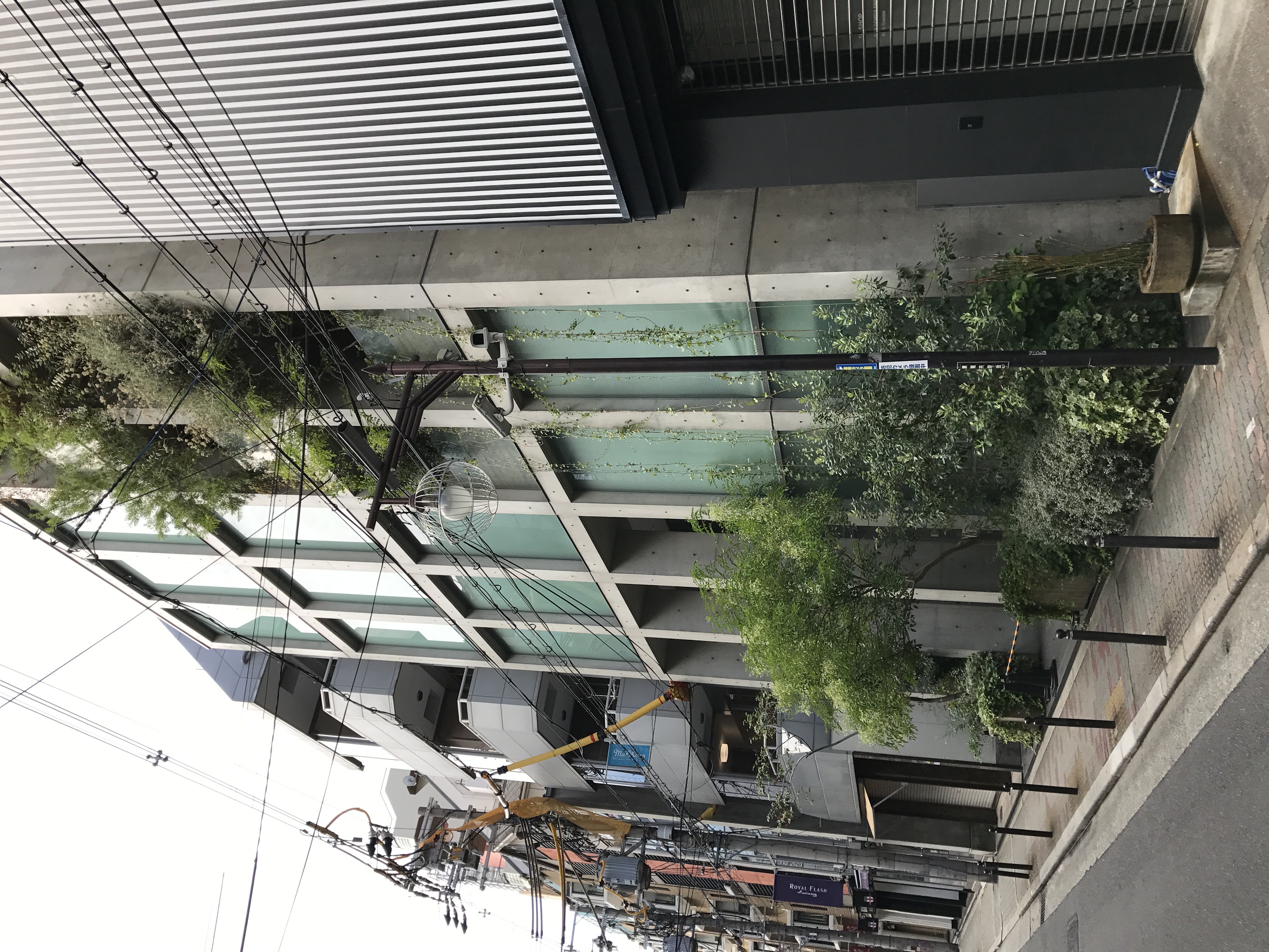
【安藤忠雄建築】アランジアロンゾビルヂング|コンクリートのグリッドに、緑とキャラクターが棲む(Aranzi Aronzo Building | Concrete, Greenery and Characters in a Grid)
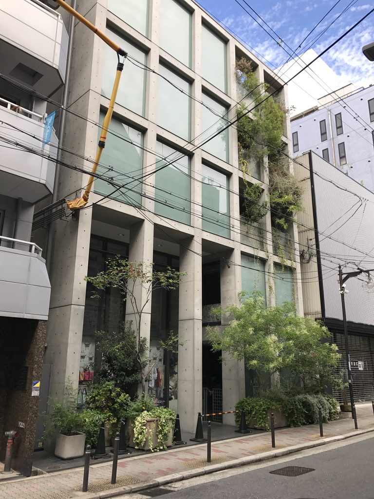
建築概要
Architecture Overview
- 名称:アランジアロンゾビルヂング
- 設計:安藤忠雄
- 所在地:大阪府大阪市中央区南船場
- 竣工:2001年
- 規模: 地下1階・地上5階
- 用途:店舗・オフィス
- Name:Aranzi Aronzo Building
- Architect:Tadao Ando
- Completed:2001
- Location:Minamisemba, Chuo-ku, Osaka, Japan
- Scale:1 basement level + 5 above-ground floors
- Type:Shop and office
大阪・南船場に建つ、キャラクターデザイン会社アランジアロンゾの本社兼店舗である。アランジアロンゾは1991年に創業し、店舗・倉庫・仕事場が周辺の複数の建物に分散していたが、それらをまとめる自社ビルとしてこの建築が計画された。創業当初から「いつか自分たちのビルをつくるなら安藤忠雄に頼みたい」と話していたというエピソードも、施主自身によって記録されている。
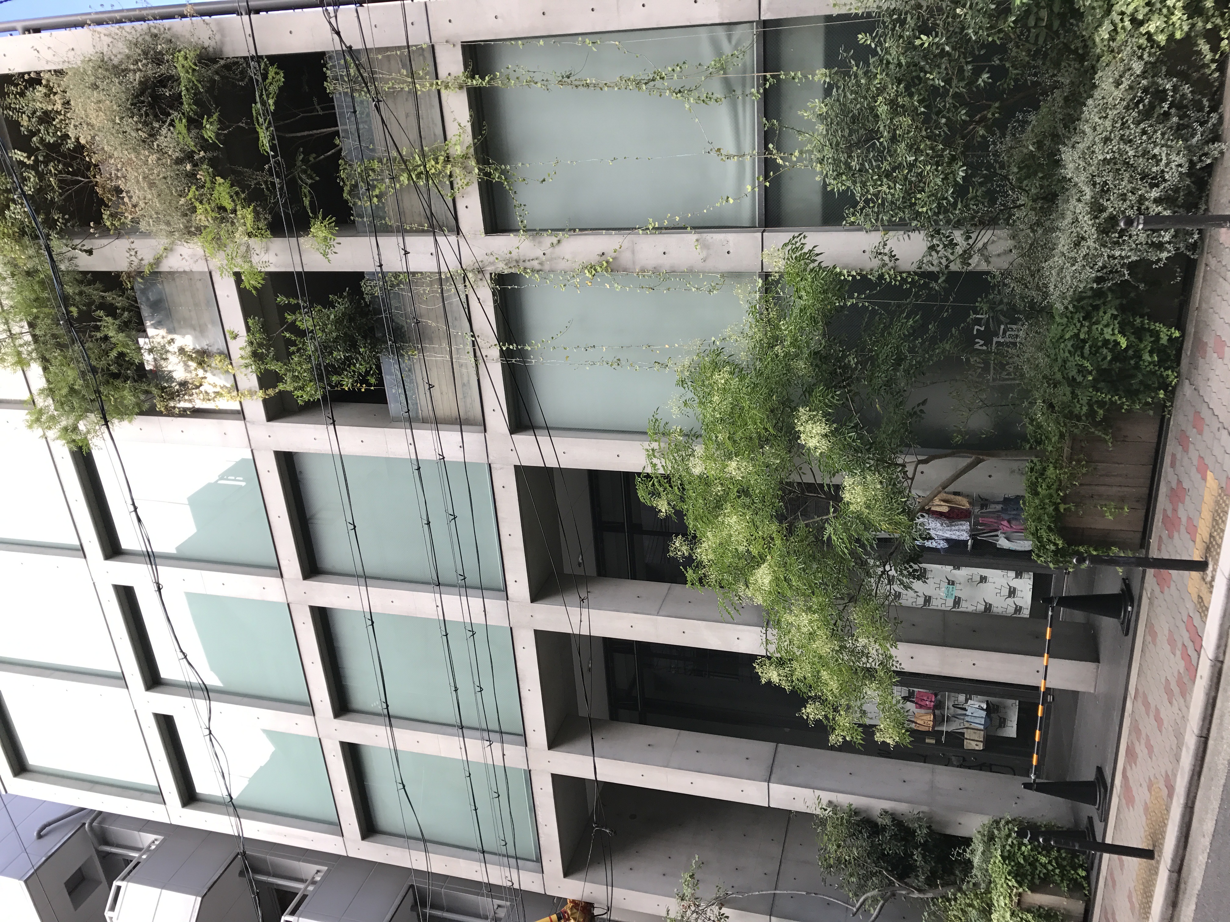
建築はRC造、地下1階・地上5階。街路側には打放しコンクリートの柱梁による明快なグリッドと大きなガラス面が繰り返され、その間に植栽が入り込む。無機質になりやすい安藤建築の幾何学に、アランジアロンゾのキャラクターや植物、商品の気配が重なることで、独特の親しみやすさを持つ都市建築となっている。
Completed in 2001, the Aranzi Aronzo Building houses the headquarters and flagship store of the Osaka-based character design company Aranzi Aronzo. Before its construction, the company’s shop, storage and working spaces had been scattered across several nearby buildings. The project brought these functions together in a purpose-built headquarters designed by Tadao Ando. Aranzi Aronzo has written that its founders had spoken from the company’s earliest days about wanting Ando to design their building if they ever had the opportunity to construct one.
The five-story reinforced-concrete building presents a clear grid of exposed concrete columns and beams toward the street. Large glazed panels, recessed spaces and extensive planting soften this geometric framework, creating an unusual combination of Ando’s restrained architectural language and the playful identity of Aranzi Aronzo.
1. 南船場に現れるコンクリートのグリッド
A Concrete Grid in Minamisemba
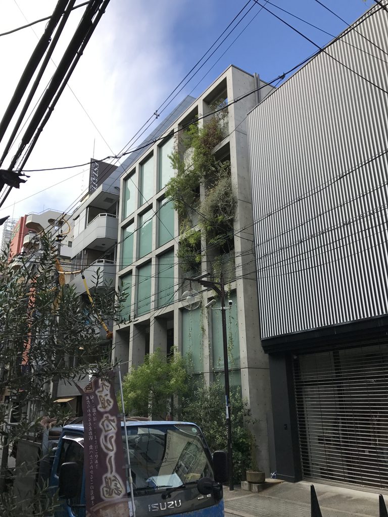
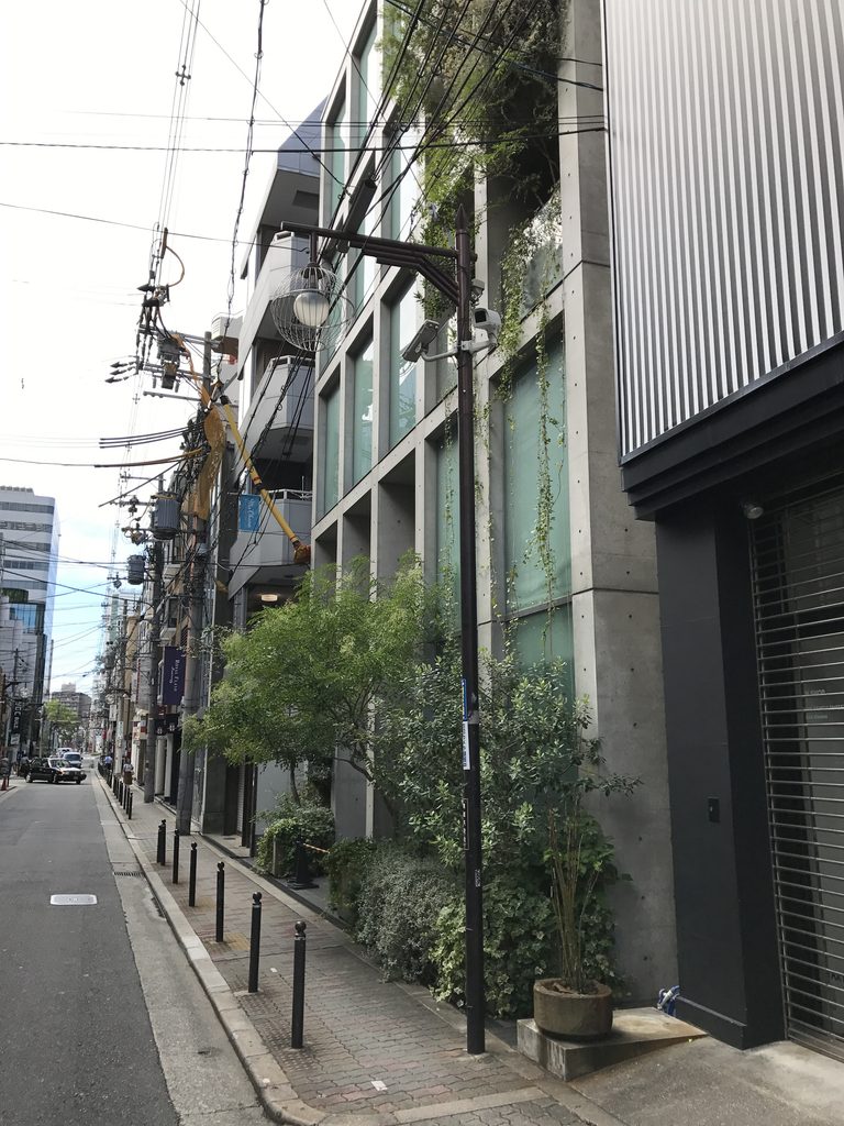
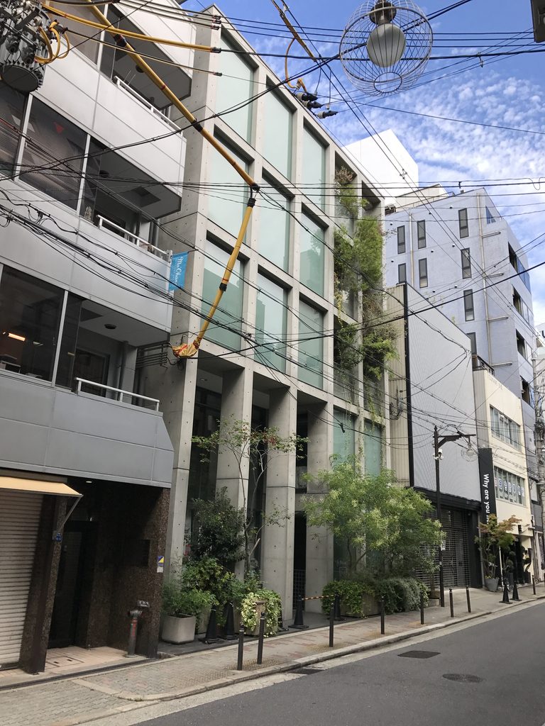
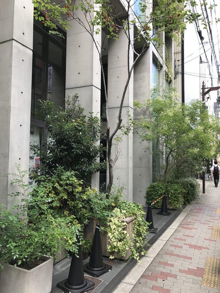
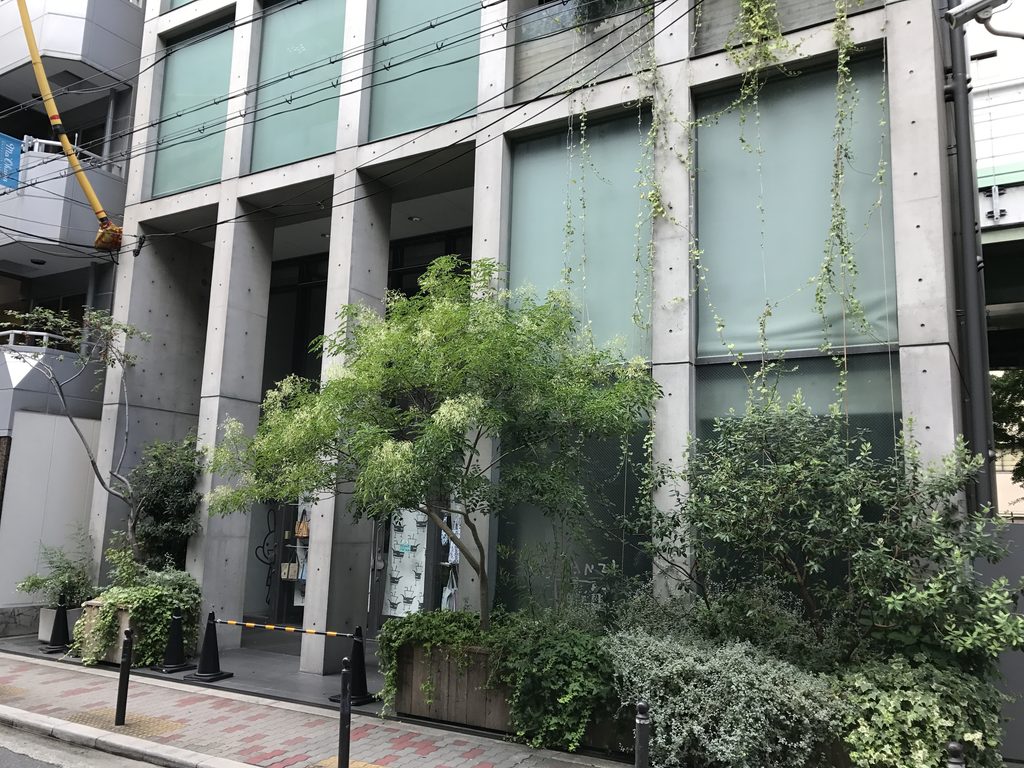
南船場の街を歩いていると、細い道路沿いに突然、規則正しいコンクリートのフレームが現れる。
Along the narrow streets of Minamisemba, a disciplined concrete framework suddenly appears among the surrounding commercial buildings.
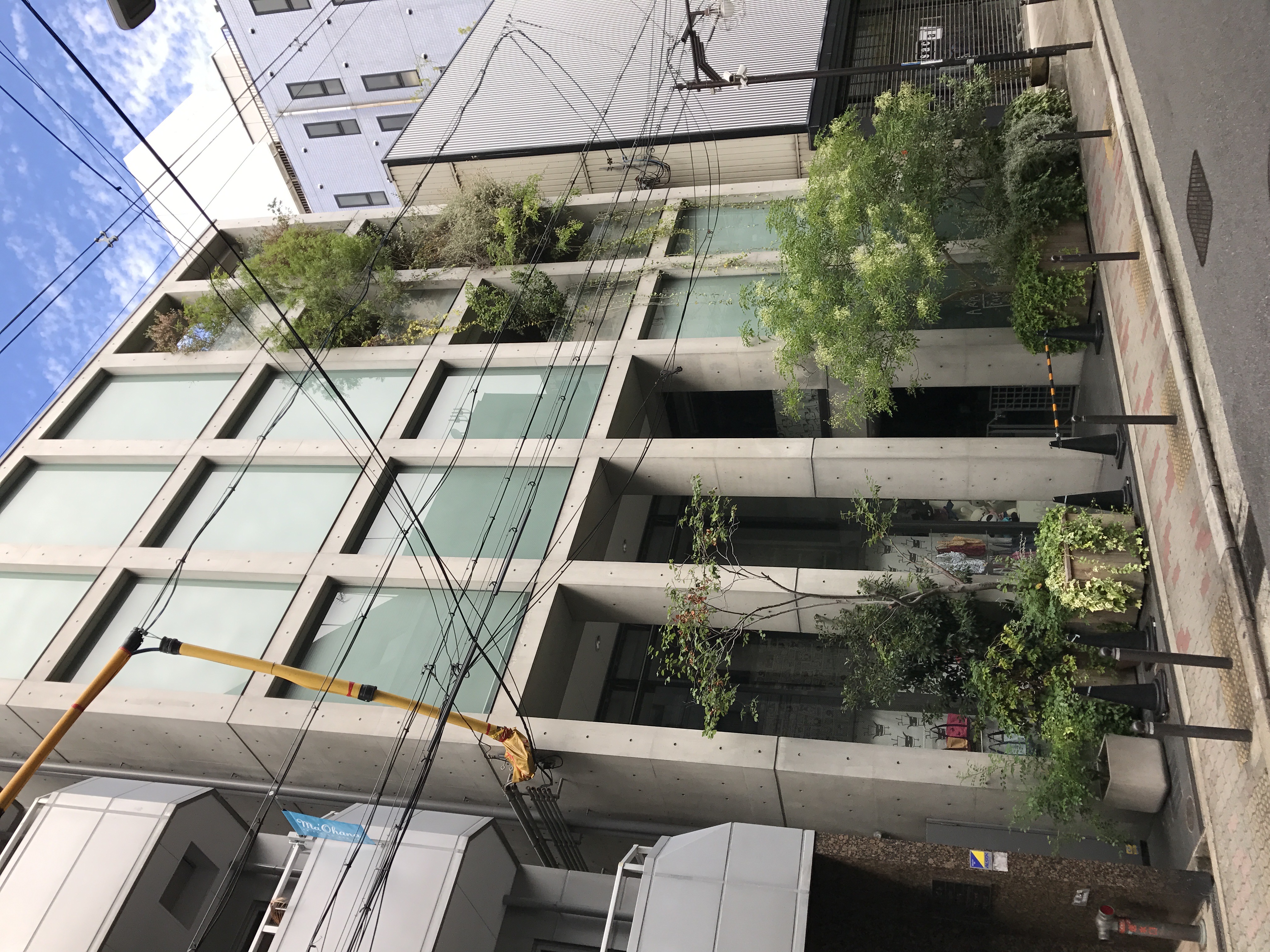
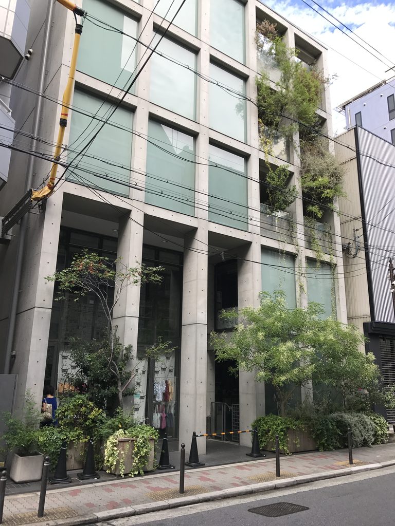
ファサードをつくっているのは、打放しコンクリートの柱と梁、そしてその間にはめ込まれた大きなガラス面である。構成自体は非常に単純で、垂直と水平の線によるグリッドが建物全体を支配している。
The facade is formed by exposed-concrete columns and beams, with broad areas of glazing inserted between them. Its basic composition is remarkably simple: vertical and horizontal lines establish a repetitive architectural grid.
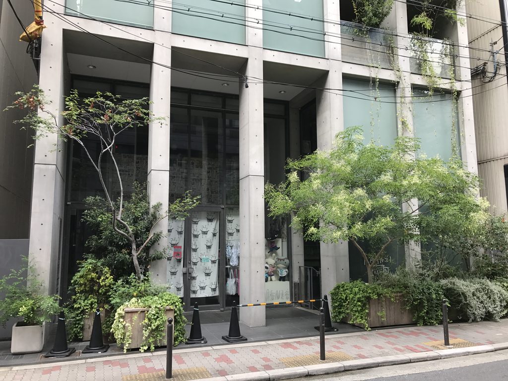
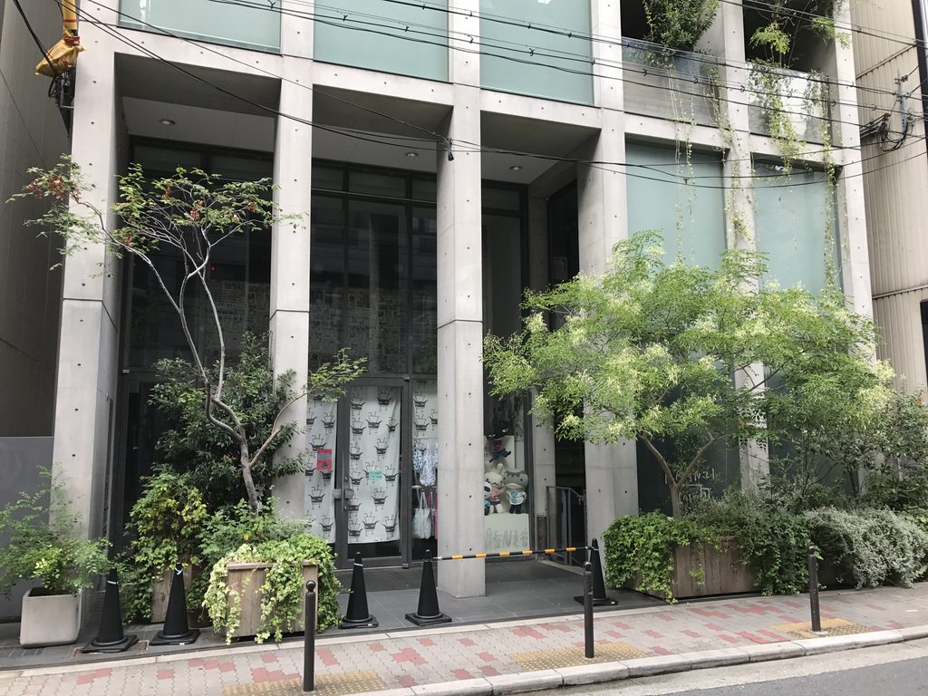
しかし、実際に街路から見る印象は決して冷たくない。低層部には植物が密集し、コンクリートのフレームの奥にも緑が入り込んでいる。
Yet the building does not feel severe. Dense planting occupies the lower levels and extends into the recessed spaces behind the concrete frame.
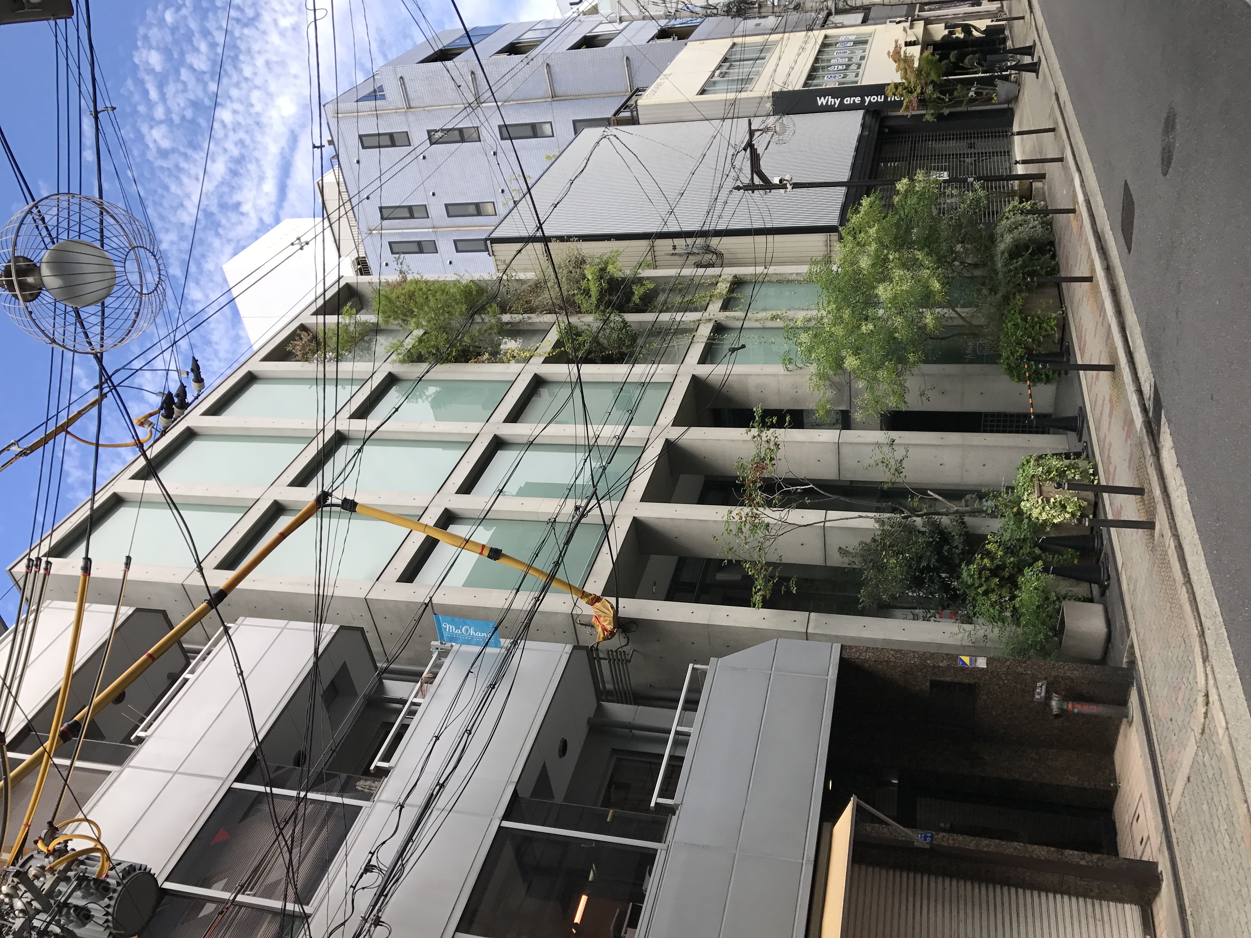
道路を横切る電線や周囲の雑多な建物を含め、南船場の日常的な都市景観の中に安藤建築の明快な幾何学が差し込まれている。その整然とした骨格と周囲の雑然とした街との対比が、この建物の最初の魅力である。
Utility wires, signs and neighboring buildings remain part of the view. Rather than separating itself from the city, the building inserts Ando’s precise geometry directly into the everyday visual complexity of Osaka.
2. 無機質な構造に入り込む緑
Greenery Within the Structure
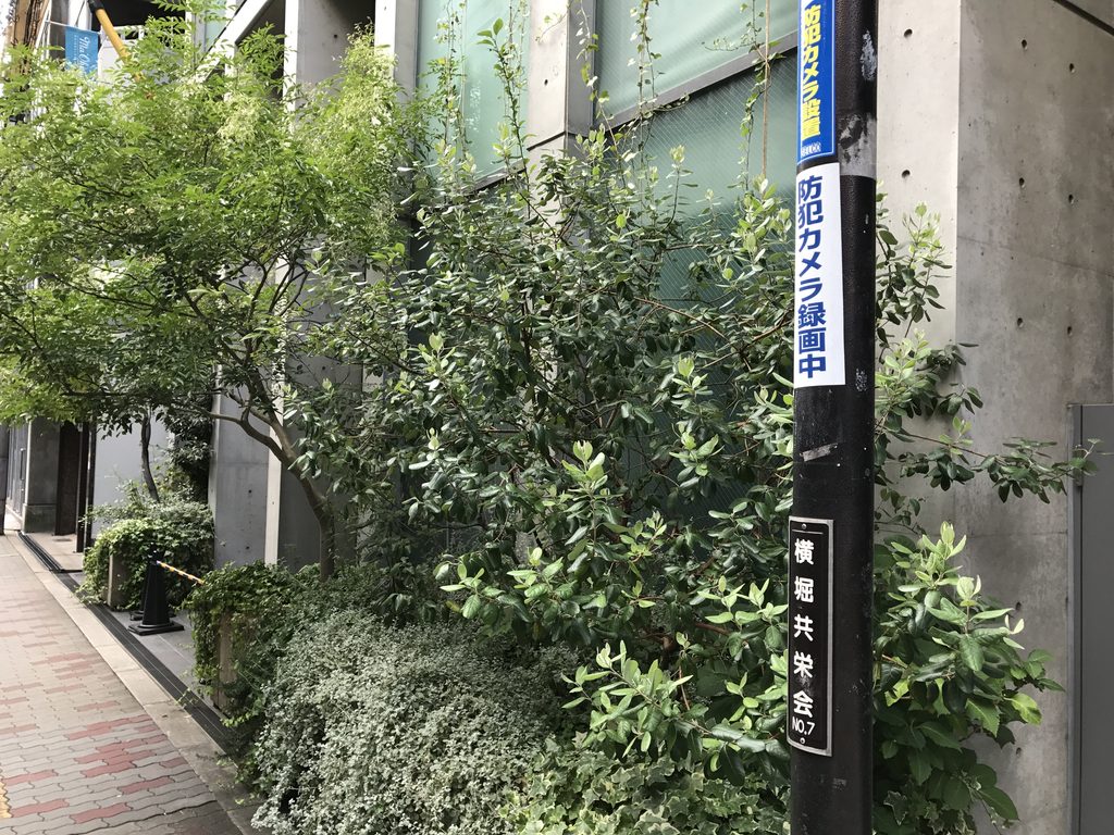
近づいて見ると、コンクリートとガラスだけで構成された建築ではないことが分かる。
Seen at closer range, the building is not simply an exercise in concrete and glass.
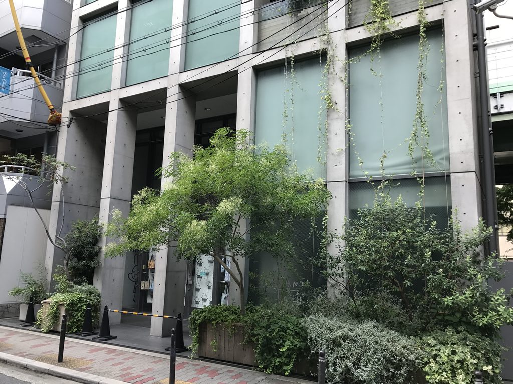
植物は建物の前に置かれた装飾ではなく、柱梁の間やバルコニー、セットバックした空間にまで入り込んでいる。時間とともに成長した緑が硬質なコンクリートの輪郭を部分的に覆い、建築の表情を変化させている。
Plants occupy the spaces between structural elements, balconies and setbacks. Over time, their irregular growth has softened the rigid outline of the architecture.
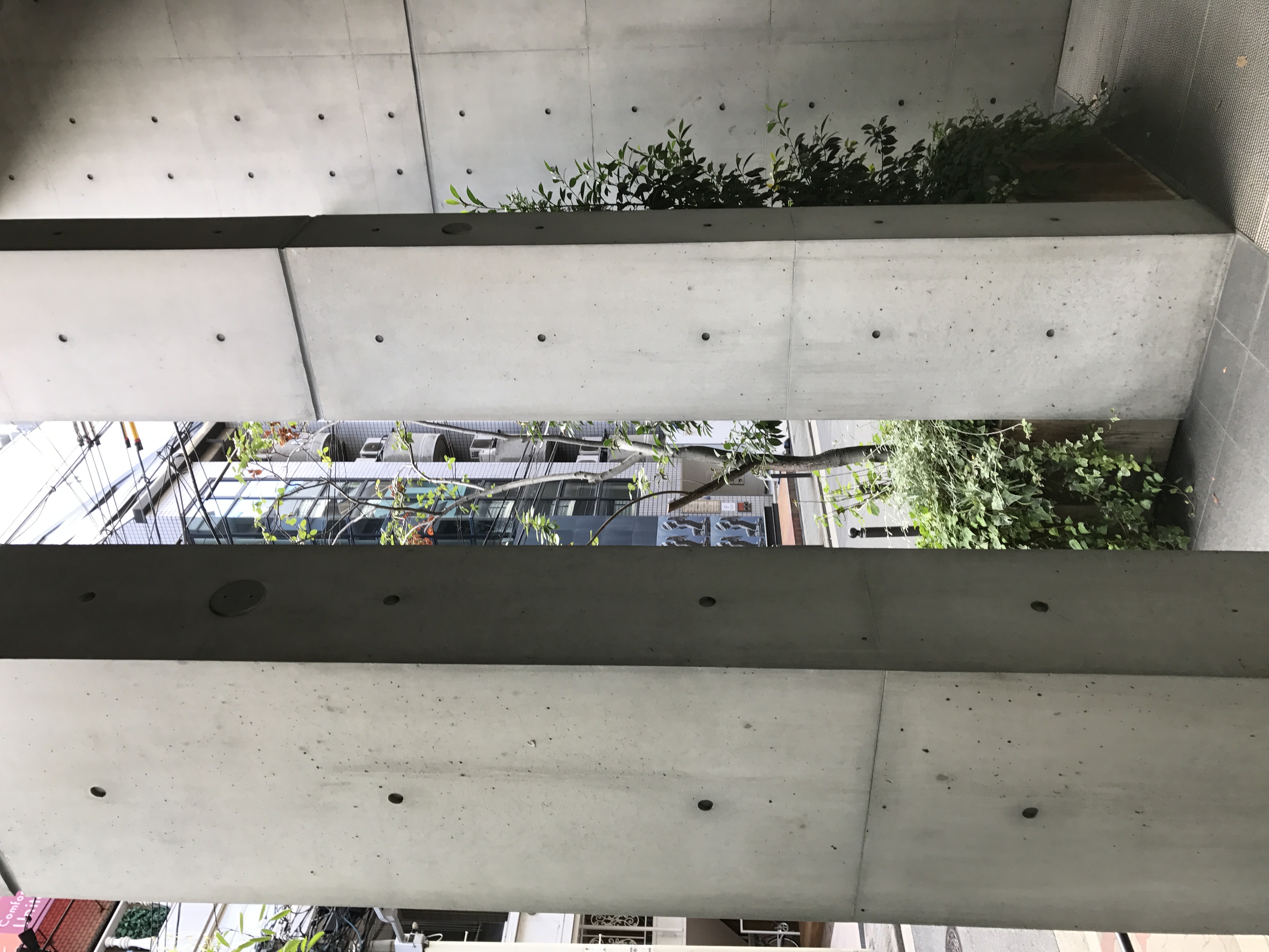
安藤忠雄の建築では、自然はしばしば光や水、風といった抽象的な要素として扱われる。しかしここでは、もっと直接的に樹木や草花が建物の内部へ侵入しているように見える。
The contrast is particularly effective: the concrete follows a precise geometric order, while the plants develop freely within and around it.
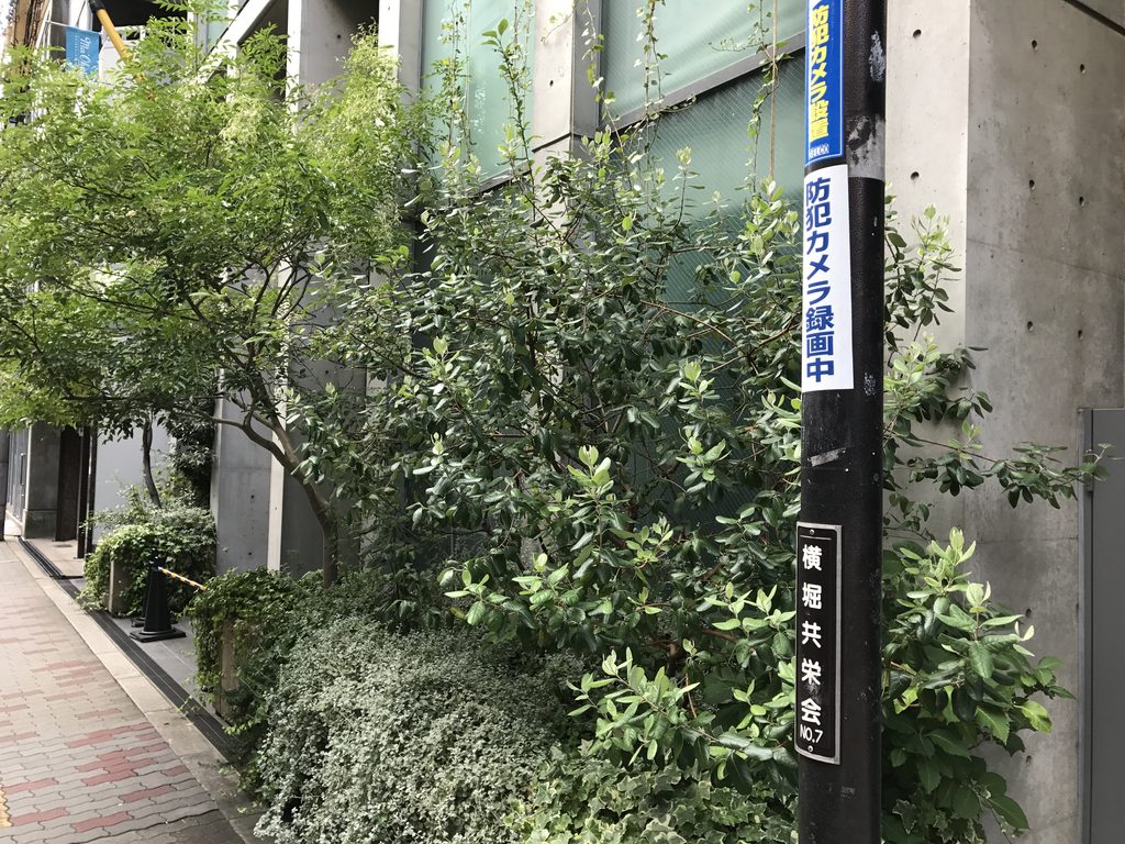
それによって、コンクリートの規則正しいグリッドと、植物の自由な形が強い対比をつくる。アランジアロンゾという会社が持つ「かわいくて、へんてこ」という世界観とも、不思議なほど相性がよい。
This combination gives the building a character that feels unexpectedly compatible with Aranzi Aronzo’s playful visual world. The architecture remains calm and controlled, allowing the objects, characters and vegetation around it to become more visible.
3. フレームの奥につくられる余白
Depth Behind the Facade
ファサードを正面から眺めるだけでは、この建物の空間的な奥行は分かりにくい。
The spatial depth of the building becomes clearer when looking beyond the street-facing grid.
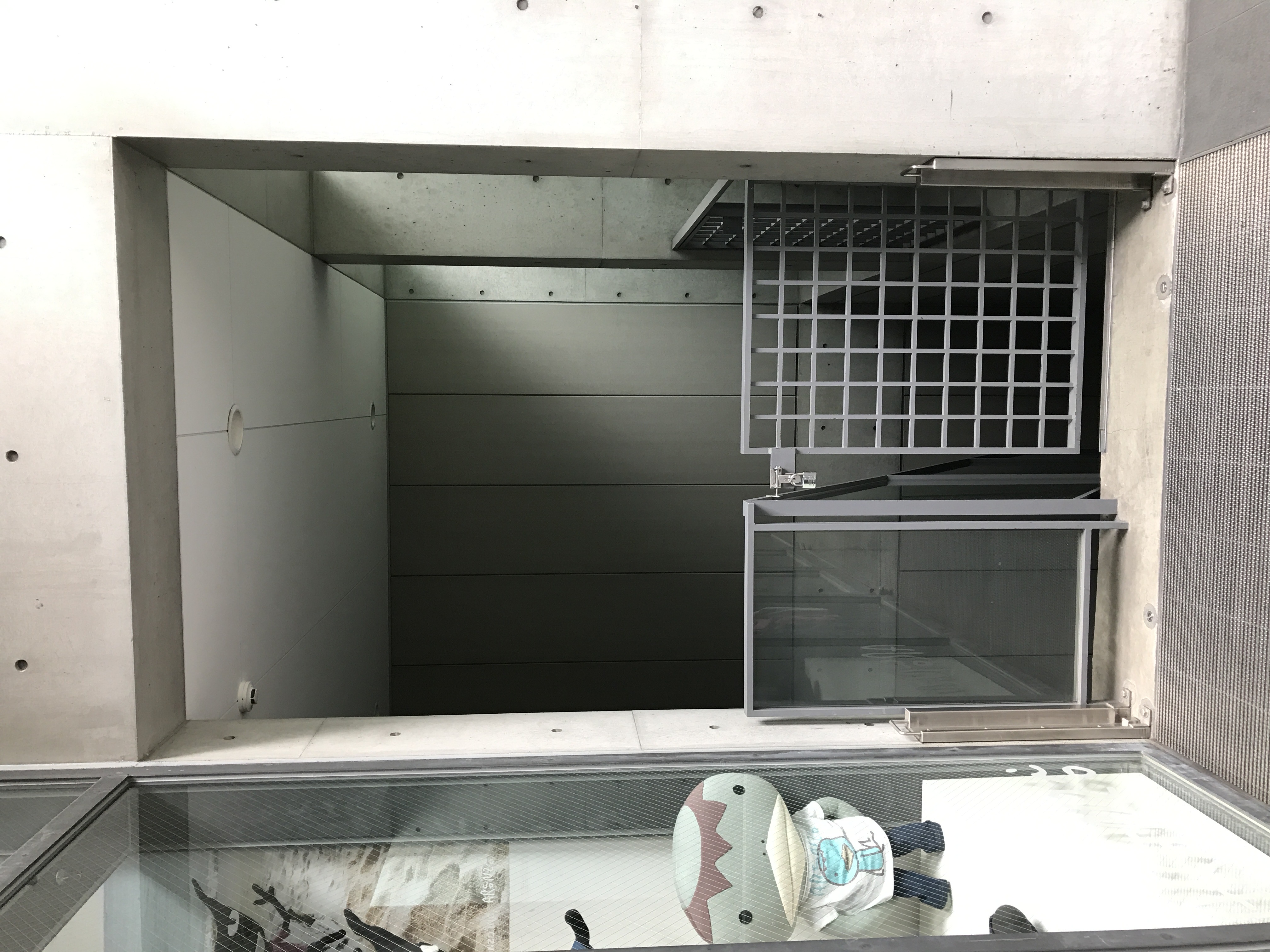
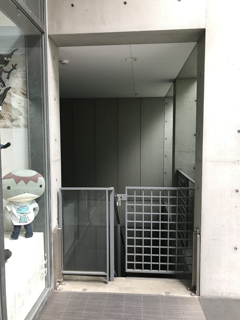
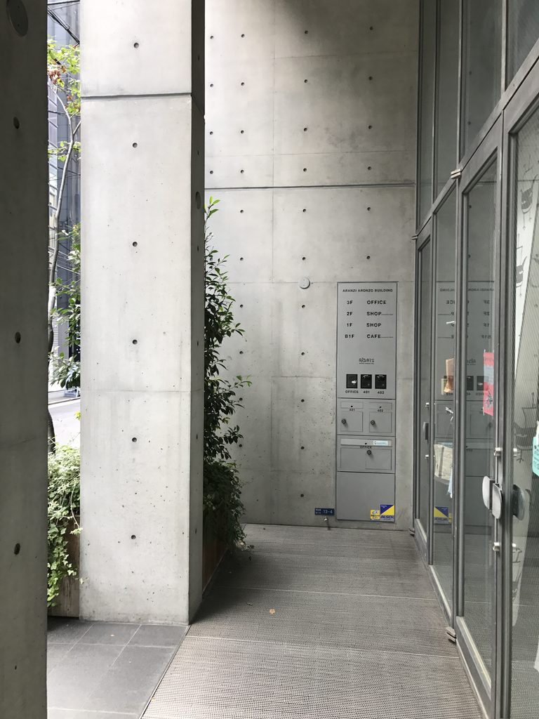
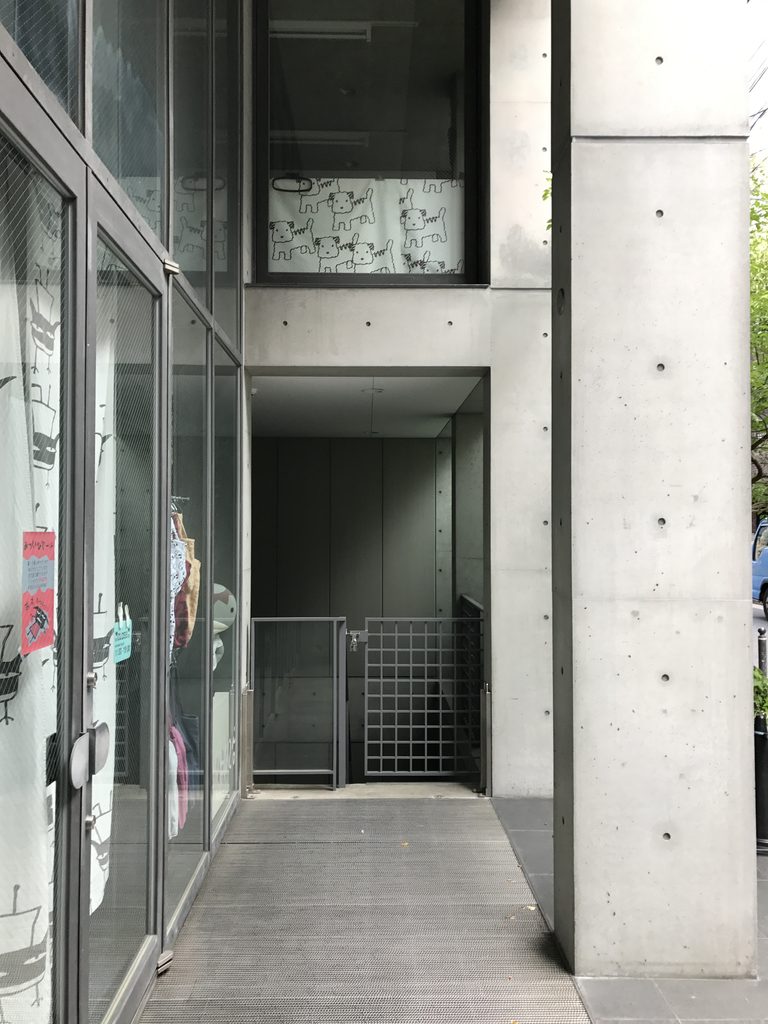
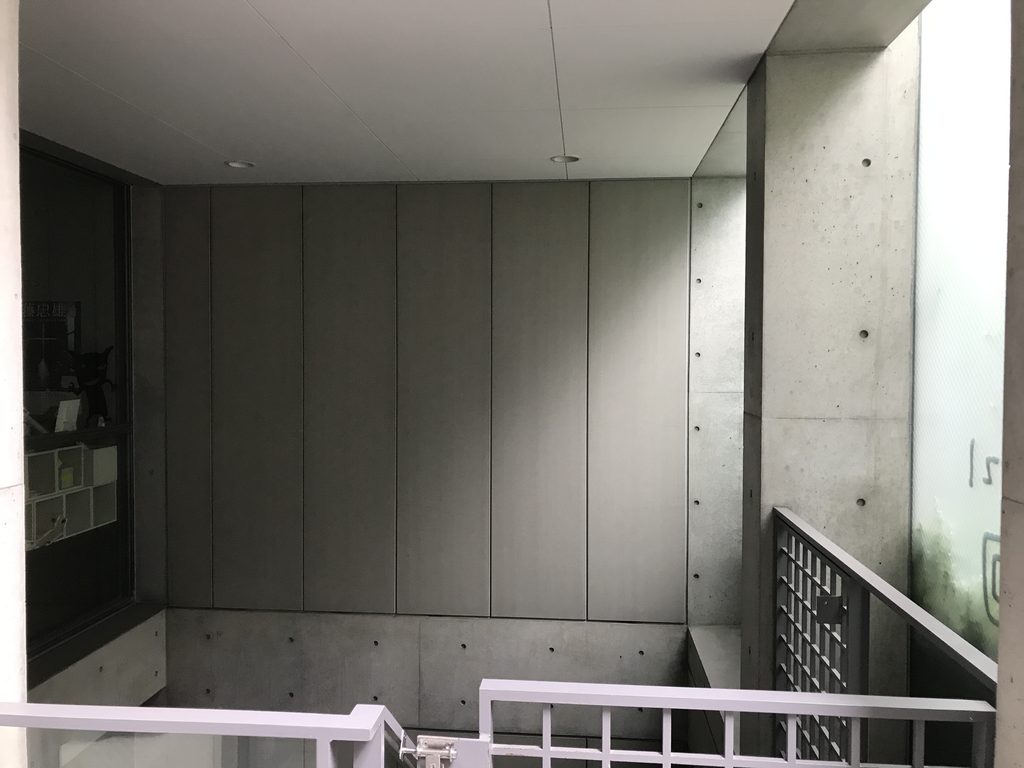
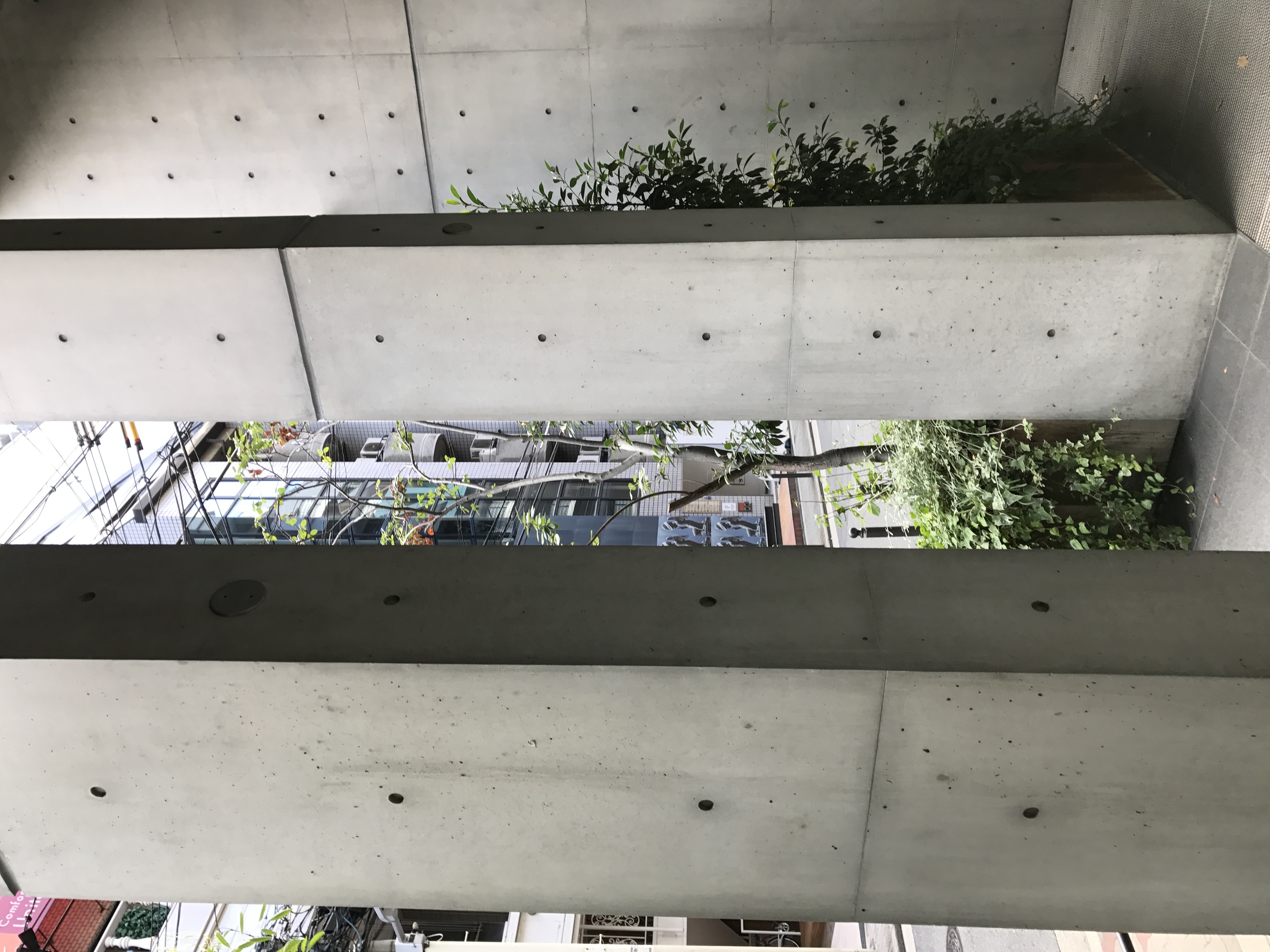
柱梁のフレームよりもガラス面や壁面を奥へ引くことで、建物の内部と街路の間に半屋外的な領域がつくられている。
Glazing and walls are set back from the outer concrete frame, creating semi-open zones between the street and the interior.
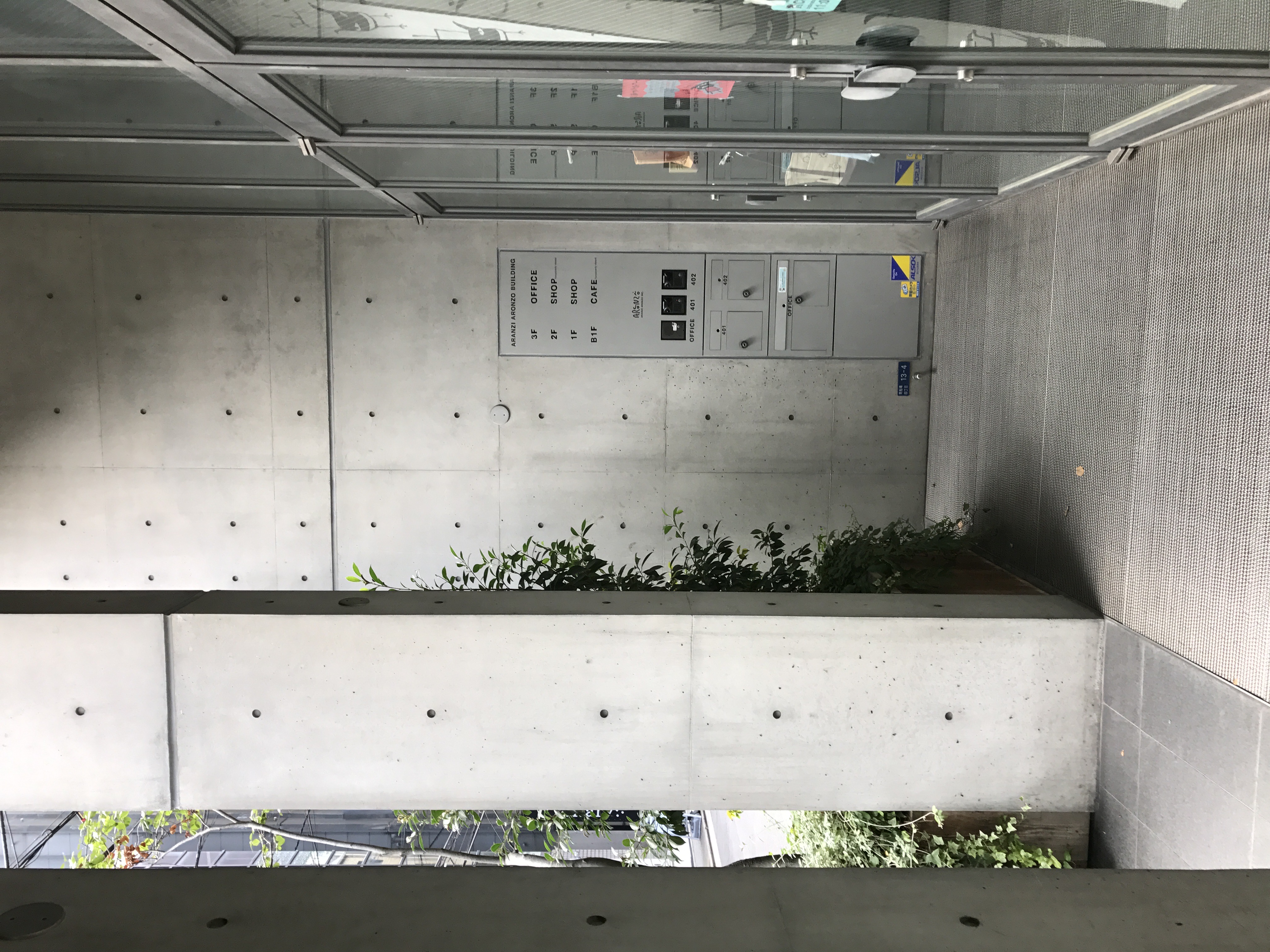
上を見上げると、コンクリートの梁、ガラス、空、そして植栽が何層にも重なる。単純な箱型のビルではなく、外壁の内側に複数の奥行を持った空間が組み込まれているのである。
Looking upward reveals several layers at once: beams, glass, sky and vegetation.
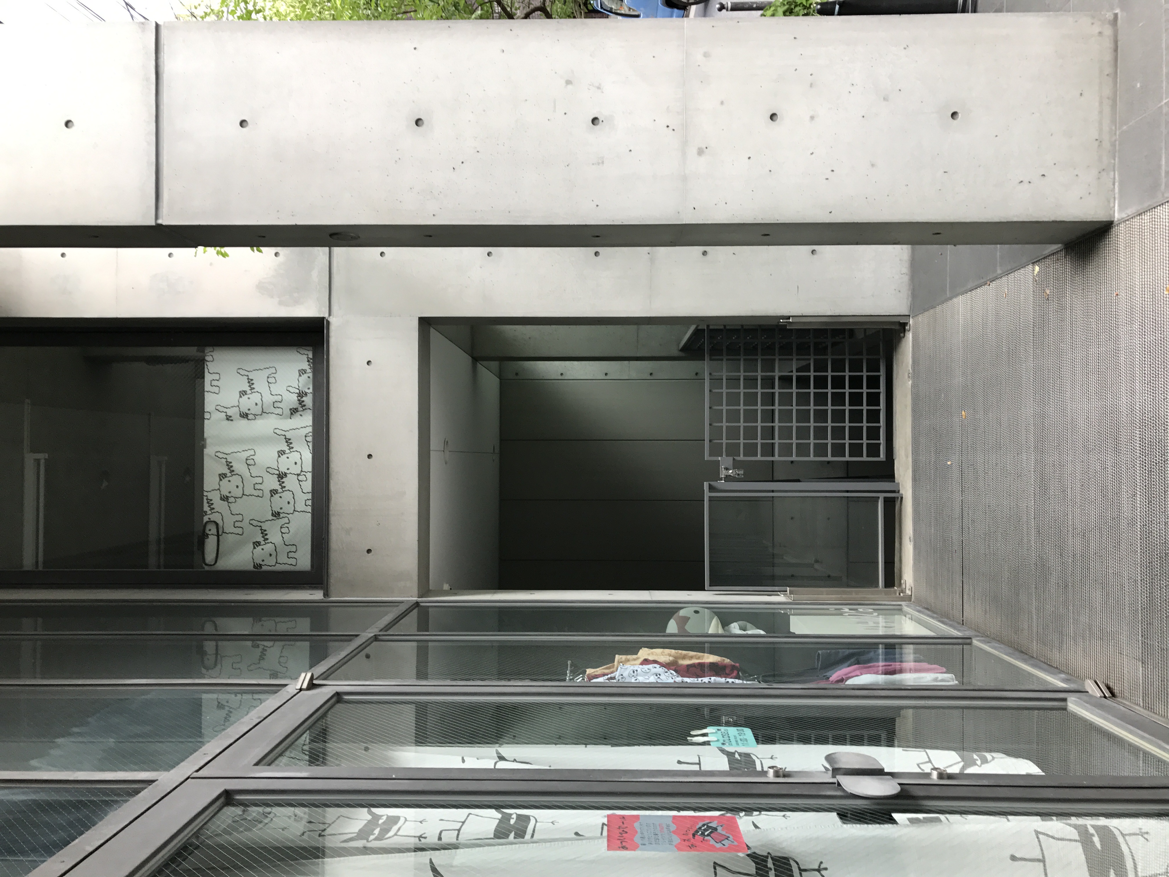
この余白があることで、街路から商品や人の気配を感じながらも、内部がそのまま露出することはない。店舗とオフィスという商業的な用途に対して、安藤忠雄らしい「境界の厚み」が与えられている。
The result is not a conventional flat commercial facade. Instead, the building creates a thick boundary between city and interior, allowing activity to be sensed without fully exposing the spaces behind it.
4. キャラクター会社と安藤建築
A Playful Company Inside a Restrained Building
アランジアロンゾ自身の記録によれば、会社設立当初から「いつかアランジビルをつくるなら安藤忠雄に建ててもらいたい」と話していたという。2001年、その構想が実際の建築となった。
According to Aranzi Aronzo’s own account, the idea of asking Tadao Ando to design a future headquarters had existed almost since the company was founded. That ambition finally became reality in 2001.
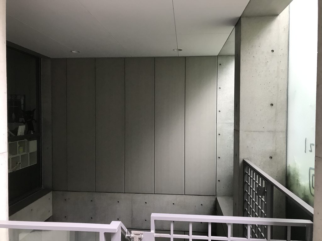
興味深いのは、安藤忠雄の建築とアランジアロンゾの世界観が、一見するとまったく逆方向に見えることである。片方は幾何学、打放しコンクリート、抑制された色彩。もう片方は個性的なキャラクター、雑貨、ユーモアに満ちている。
At first glance, the pairing seems unlikely. Ando’s architecture is associated with exposed concrete, geometric order and restraint, while Aranzi Aronzo is known for humorous and eccentric characters and objects.
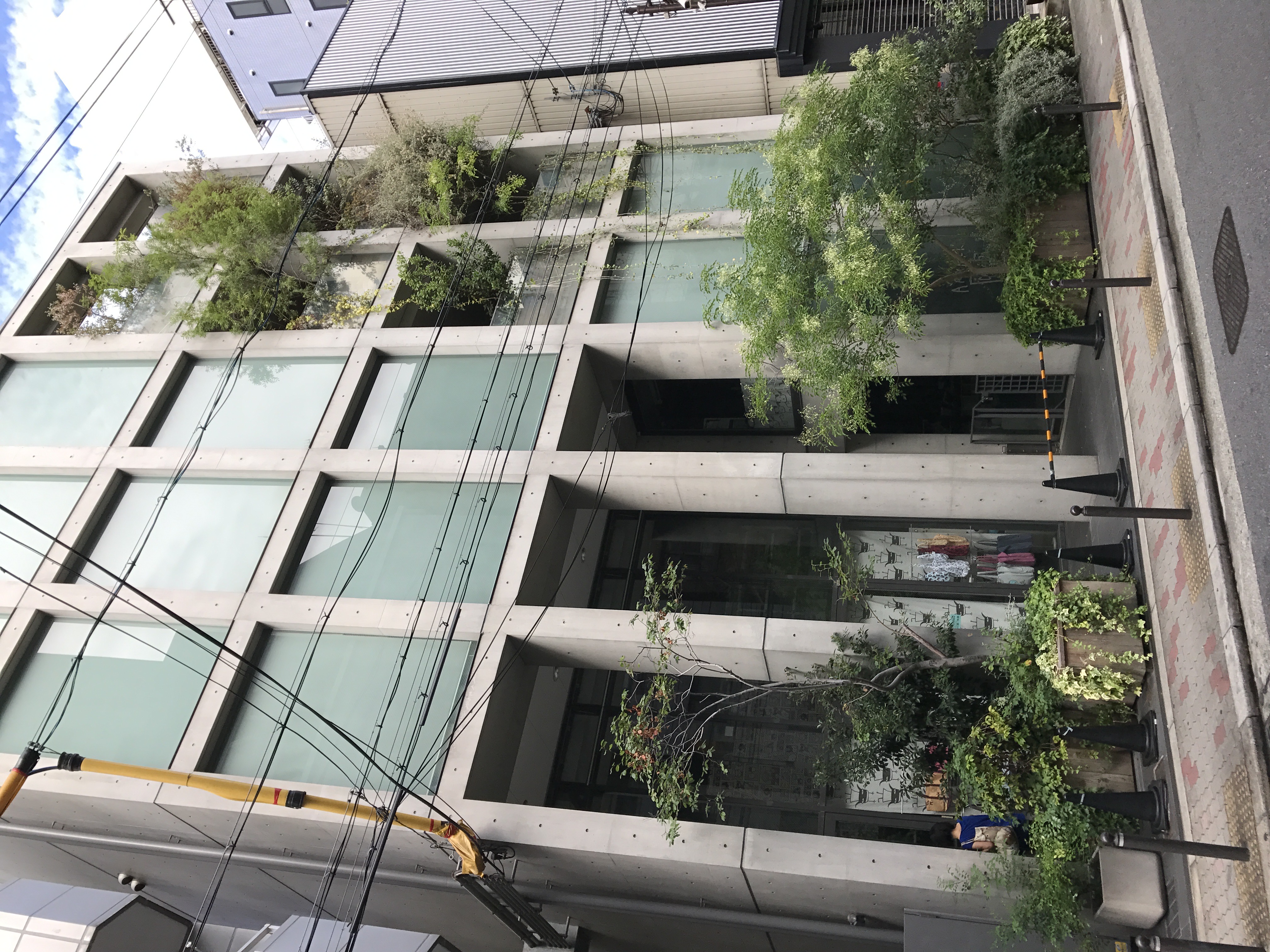
ところが、この違いが建物ではむしろ効果的に働いている。コンクリートの静かな背景があることで、キャラクターや商品、植物の存在が際立つ。
建築がブランドの個性を直接表現するのではなく、あえて極端に抑制された器となる。そのために、そこで働く人や置かれるものによって建物が少しずつ完成していくようにも見える。
In practice, however, the contrast works extremely well. The quiet architectural framework acts as a background against which the company’s characters, merchandise and plants stand out.
Rather than illustrating the brand directly, the architecture provides a disciplined container that gradually acquires identity through the people and objects occupying it.
5. 正面と背面、二つの顔
Two Faces of the Same Building
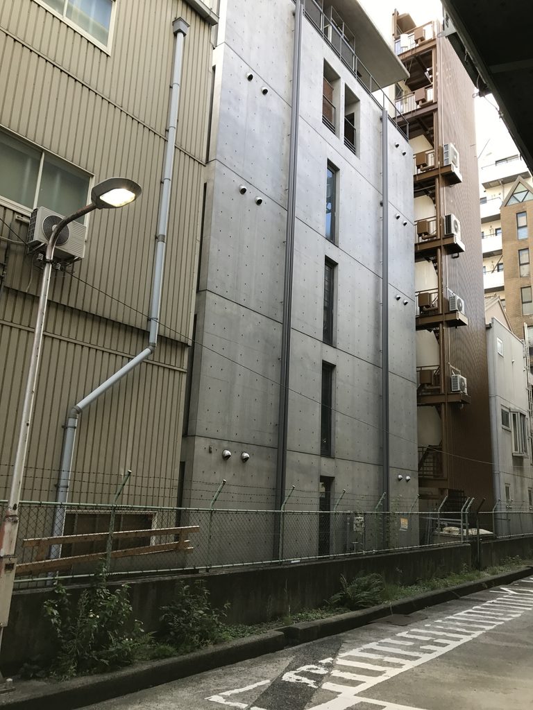
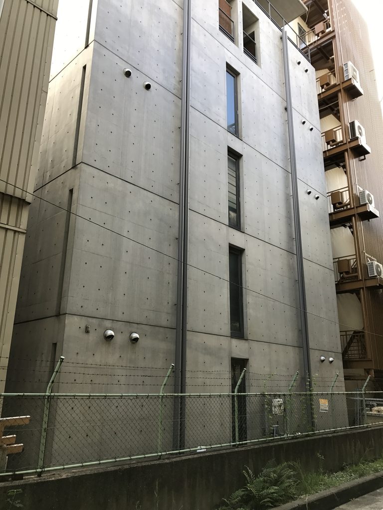
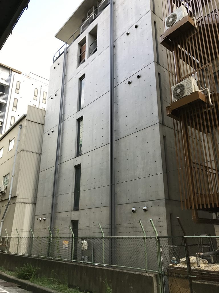
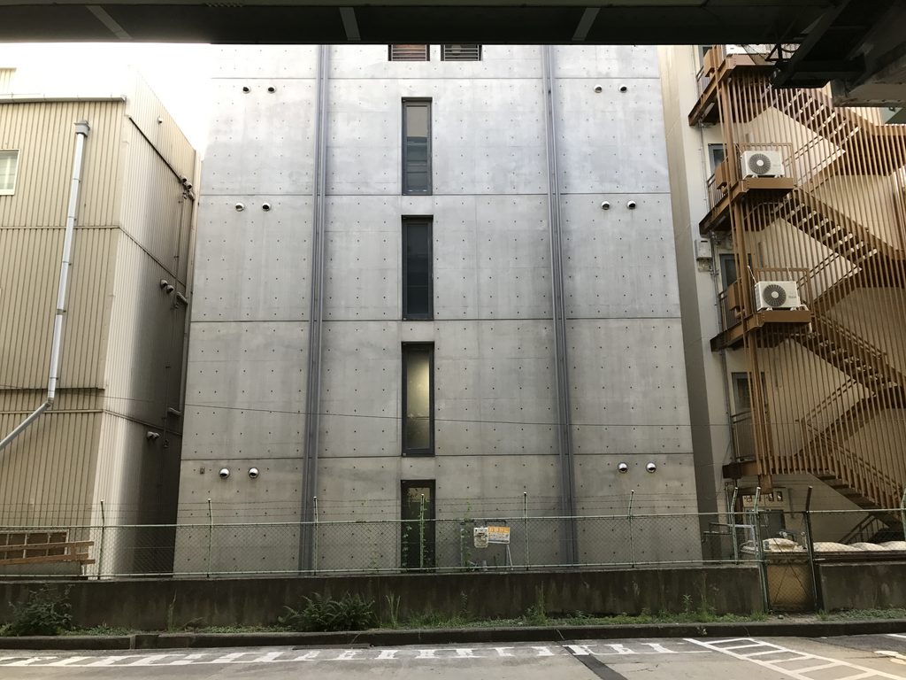
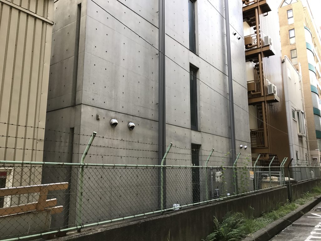
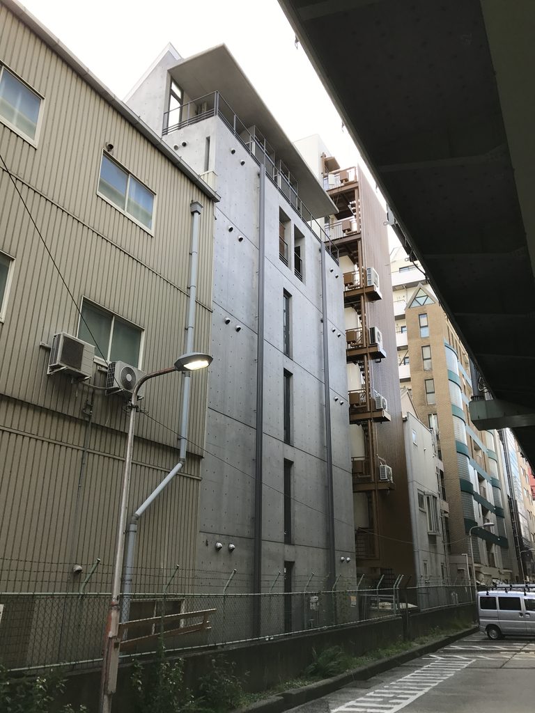
表通り側の開放的なファサードとは対照的に、背面に回ると建物の表情は大きく変わる。
The rear elevation presents an entirely different character.
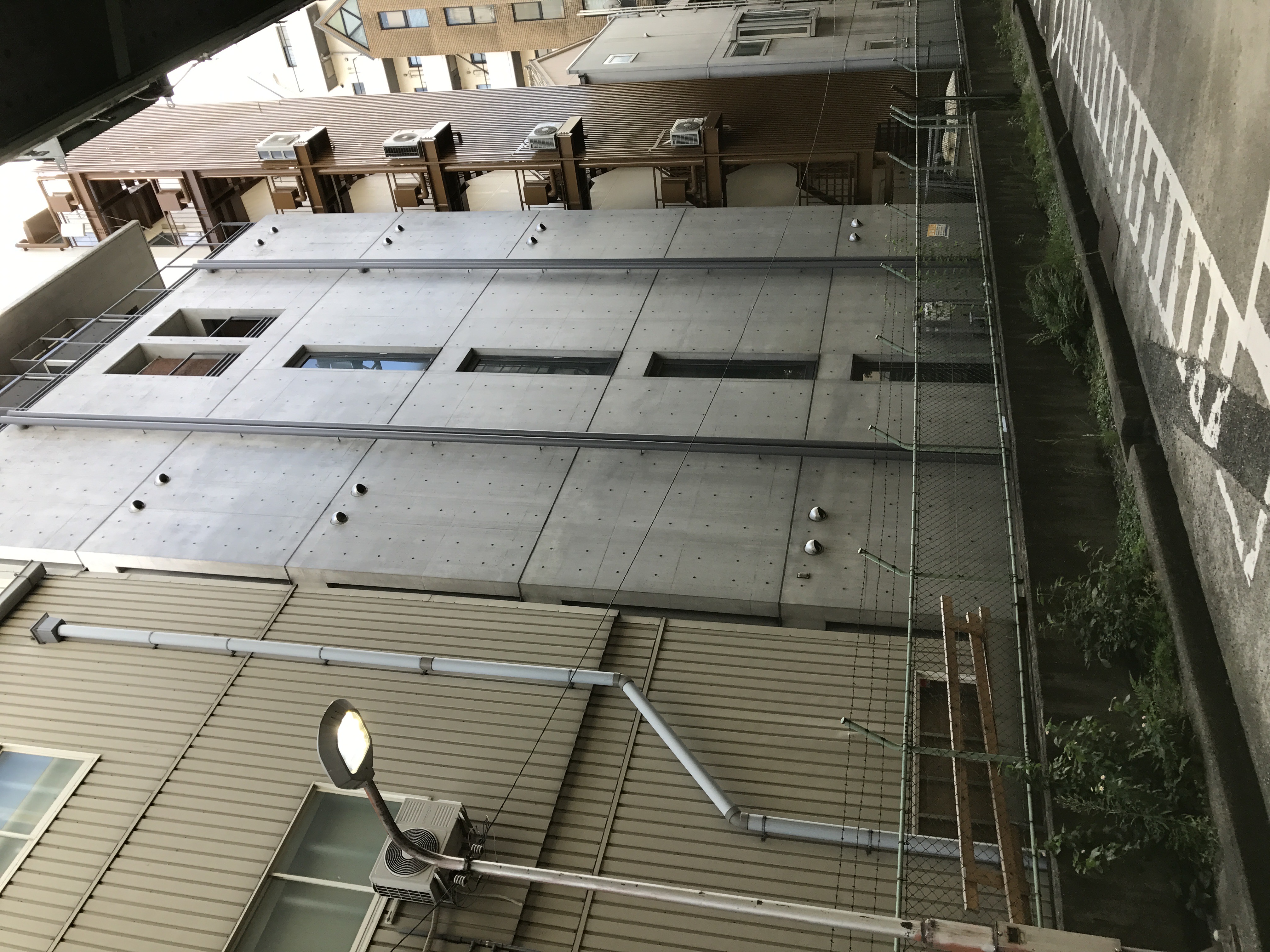
こちらではガラス面や植栽はほとんど姿を消し、巨大な打放しコンクリートの壁が現れる。
The glazing and vegetation largely disappear, replaced by a broad surface of exposed concrete.
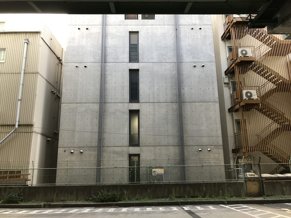
中央には細長い垂直窓が並び、設備類も比較的素直に壁面へ取り付けられている。正面が店舗や会社の顔として都市に開かれているのに対し、背面は必要な開口だけを残した極めて閉鎖的な構成である。
Only narrow vertical windows interrupt the wall, while building services are attached directly to the facade.
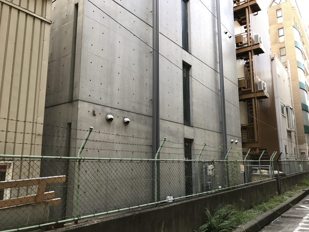
同じ建物でありながら、表側ではコンクリート、ガラス、植栽が複雑に重なり、裏側では一枚の壁に近い表情になる。この明確な切り替えによって、都市に対してどこを開き、どこを閉じるかという安藤忠雄の設計意図がよく見える。
The difference between front and back is striking. The street facade opens the building toward the city through glass, depth and vegetation, while the rear is deliberately closed. Together, these two elevations reveal a clear distinction between the public and service sides of the building.
My Impression
アランジアロンゾビルヂングは、写真で見る以上に「街に馴染んでいる安藤建築」という印象が強かった。巨大な美術館や公共建築のように、離れた場所から建築全体を眺める作品ではない。
南船場の細い道路を歩いていて、普通のビルの連続の中から打放しコンクリートのグリッドが突然現れる。その距離感が、この建物にはよく似合っている。
また、コンクリートそのものよりも、そこに入り込んだ植物が強く印象に残った。完成から年月が経過し、植栽が成長したことで、安藤忠雄が設計した幾何学と自然がかなり複雑に重なっている。
一方で建物の裏側へ回ると、そこには非常に無口なコンクリートの壁がある。正面との落差も含めて、規模は小さいながら見どころの多い建築であった。
何より面白いのは、「自分たちのビルを建てるなら安藤忠雄に頼みたい」と創業時から考えていた会社が、本当にその夢を実現した建物であるということである。建築そのものだけでなく、施主と建築家の関係まで含めて記憶に残る作品である。
The Aranzi Aronzo Building felt less like an isolated architectural object and more like an Ando building embedded directly in the city.
Walking through the narrow streets of Minamisemba, the concrete grid suddenly emerges from a continuous line of ordinary buildings. That proximity suits the project well.
The greenery was particularly memorable. After more than two decades, plants have become an important part of the facade, overlapping Ando’s carefully ordered concrete framework.
The rear elevation offers an almost opposite experience: quiet, closed and dominated by a single concrete wall.
What makes the project especially appealing is the story behind it. The founders of Aranzi Aronzo had apparently imagined having Tadao Ando design their own building long before they were in a position to build one. The completed architecture therefore represents not only a workplace and store, but also the realization of a long-held ambition.
Archive Gallery