【安藤忠雄建築】W大阪|御堂筋の黒い外観と、その内側に広がる華やかな世界(W Osaka|A Dark Facade on Midosuji and the Extravagant World Within)
建築概要
Architecture Overview
- 名称:W大阪
- デザイン監修: 安藤忠雄
- 建築設計・監理: 日建設計
- 所在地:大阪府大阪市中央区南船場4丁目1-3
- 竣工:2021年(日建設計の作品情報による。2020年とする資料もある)
- 開業: 2021年3月16日
- 規模: 地上27階・地下1階
- 高さ: 約118m
- 延床面積: 約35,816㎡
- 客室数: 337室
- 用途:ホテル
- Name:W Osaka
- Design Supervision:Tadao Ando
- Architectural Design and Supervision:Nikken Sekkei
- Completed:2021 (according to Nikken Sekkei; some sources list 2020)
- Opening:March 16, 2021
- Location:4-1-3 Minamisemba, Chuo-ku, Osaka, Japan
- Floors:27 above ground and one basement level
- Height:Approximately 118 m
- Total Floor Area:Approximately 35,816 m²
- Guest Rooms:337
- Type:Hotel
大阪の中心部を南北に貫く御堂筋。その沿道に建つW大阪は、2021年に開業した日本初のWホテルである。
安藤忠雄がデザイン監修を担当し、建築設計・監理を日建設計が手がけた。インテリアデザインにはオランダのConcrete Architectural Associatesをはじめとするデザイナーが参加している。
このホテルを特徴づけるのは、黒を基調とした外観と、色彩や装飾を大胆に取り入れた内部空間の対比である。
高層部は直線的な外壁によって端正にまとめられ、御堂筋に面する低層部には大きなガラス面が設けられている。しかし、その入口を通り抜けると、外からは想像しにくい曲面や幾何学的な装飾が現れる。
W大阪は、都市に向けた建築の表情と、訪れる人に向けたホテルの演出が、意識的に切り替えられた建物である。
W Osaka stands along Midosuji, the broad avenue running through the heart of Osaka. Opened in 2021 as Japan’s first W hotel, the building was developed with design supervision by Tadao Ando, while Nikken Sekkei was responsible for its architectural design and supervision.
The interior design involved several designers, including the Netherlands-based Concrete Architectural Associates.
One of the hotel’s most distinctive characteristics is the contrast between its restrained black exterior and the expressive use of color, materials and decorative forms inside.
The tower presents a disciplined composition of vertical lines and dark surfaces to the city. At street level, large expanses of glass form the entrance. Beyond them, however, the atmosphere changes dramatically, revealing curved spaces, elaborate ceiling designs and striking sculptural installations.
W Osaka is a building in which the relationship between the exterior and interior is deliberately transformed as visitors move through it.
1. 御堂筋に立ち上がる、黒い高層建築
A Dark Tower Rising Above Midosuji
W大阪の外観を特徴づけているのは、黒を基調とした高層部の外壁である。
御堂筋には多くのオフィスビルや商業施設が立ち並んでいる。そのなかでW大阪は、外壁の色彩を抑えることで、かえって独特の存在感を生み出している。
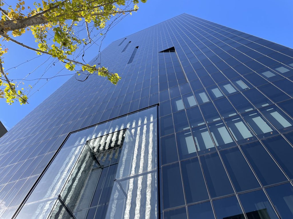
建物を下から見上げると、細い縦方向のラインが高層部まで続いている。窓は外壁のなかに規則的に配置され、黒い面の連続を大きく崩さない。
一方、外壁は完全に平坦な一枚の面ではない。ガラスの反射や縦方向の部材によって細かな変化が生まれ、見る角度によって黒の濃淡も異なって見える。
写真では、青空を背景に高層部が大きく立ち上がり、手前には街路樹の枝が重なっている。
周囲の建物と比較して際立つのは、装飾を加えるのではなく、建物全体の輪郭と外壁の反復によって印象をつくっている点である。
The defining feature of W Osaka’s exterior is its predominantly black facade.
Midosuji is lined with office buildings, commercial developments and hotels. Among them, W Osaka establishes a distinctive presence through its restrained palette rather than elaborate external ornamentation.
Looking up from the street, slender vertical lines extend along the tower. The windows are arranged in a regular pattern, without significantly interrupting the continuity of the dark surfaces.
Yet the facade is not simply a flat black plane. Subtle changes in depth, vertical components and reflections in the glazing introduce variations that become more apparent as the viewing angle changes.
In the photograph, the tower rises against a clear blue sky, while branches of nearby street trees extend across the foreground.
The building’s visual identity emerges primarily through its overall silhouette and the repetition of elements across the facade.
黒い外壁という選択は、単に高級感を演出するためだけのものとは限らない。建築の外側を抑制的にまとめることで、内部の華やかな空間との違いを際立たせる役割も担っていると考えられる。
ただし、こうした外観と内部の対比は、Wホテル全体のデザインコンセプトとも関係している。建築の印象を読み解く際には、安藤忠雄の監修とホテルブランドの方向性を分けて捉える必要がある。
The choice of a dark exterior may also be understood in relation to the experience awaiting visitors inside.
By maintaining a relatively restrained appearance towards the city, the building establishes a striking contrast with the colorful and highly decorated interior.
This relationship, however, should not be attributed solely to Ando. The contrast between minimalism and exuberance is also central to the W Osaka hotel concept, developed through the collaboration of several design teams.
Understanding these different contributions is essential when considering the architectural character of the building.
2. 都市の風景を映し込むガラスの入口
A Glass Entrance Reflecting the City
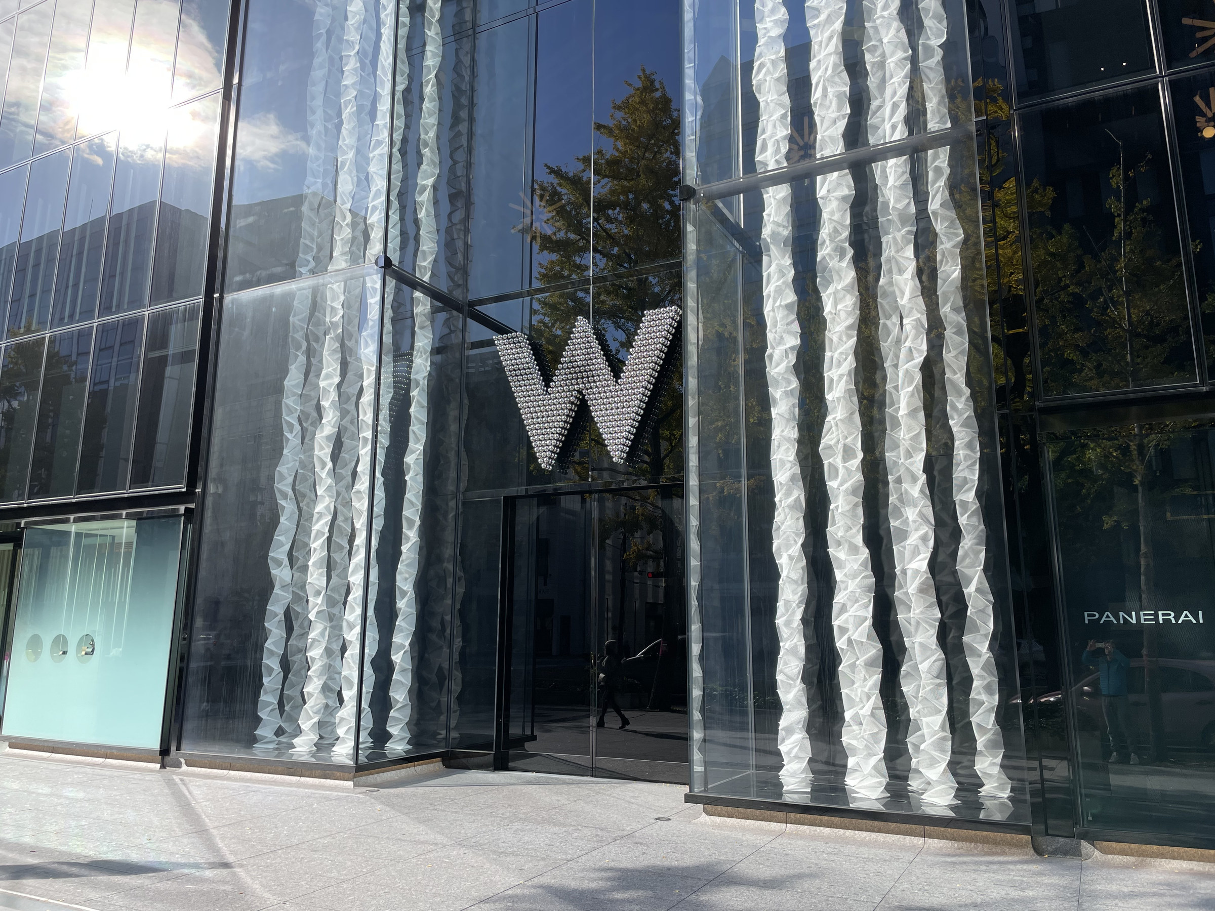
高層部の黒い外壁に対し、建物の足元には大きなガラス面が広がっている。
正面入口にはWのロゴが掲げられ、その両側に白い波状の装飾が垂直に伸びている。
この装飾は、平らなガラス面の前に置かれた立体的な要素として見える。黒い外壁と透明なガラスの組み合わせのなかで、白い起伏が強いアクセントになっている。
At the base of the tower, the dark exterior gives way to a large glazed entrance.
A prominent W logo marks the main doorway. On either side, white sculptural elements rise vertically, their undulating surfaces introducing movement into the otherwise rectilinear composition.
These elements stand out against the transparent glass and dark facade, creating a distinctive entrance without extending the same decorative treatment across the entire building.
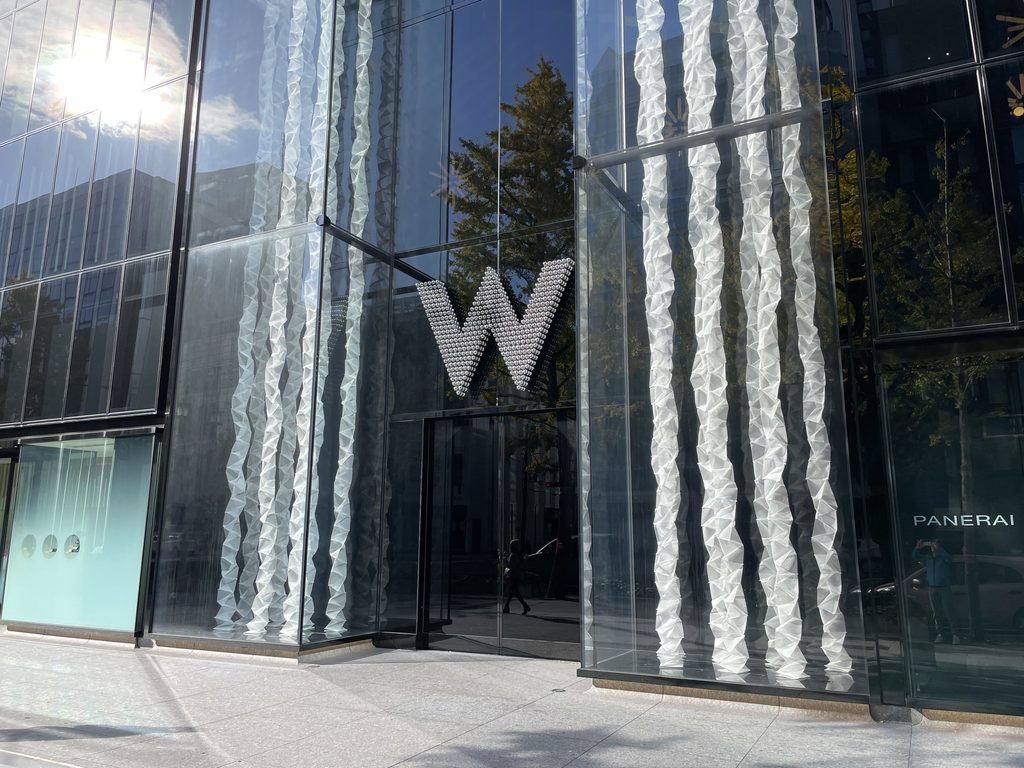
正面に立つと、左右の装飾がWのロゴを挟むように配置されていることが分かる。
ガラス面には向かい側の建物や街路樹が映り込み、入口の表情は周囲の風景によって変化する。
写真では、Wのロゴの奥にも建物の内部が見えているが、ガラスの反射が重なるため、外と内の境界は一見すると曖昧である。
Seen directly from the front, the white elements appear to frame the W logo.
The glass reflects nearby buildings and street trees, allowing the surrounding city to become part of the entrance’s appearance.
Although portions of the interior are visible through the glazing, reflections overlap with the view beyond, making the boundary between inside and outside less immediately apparent.
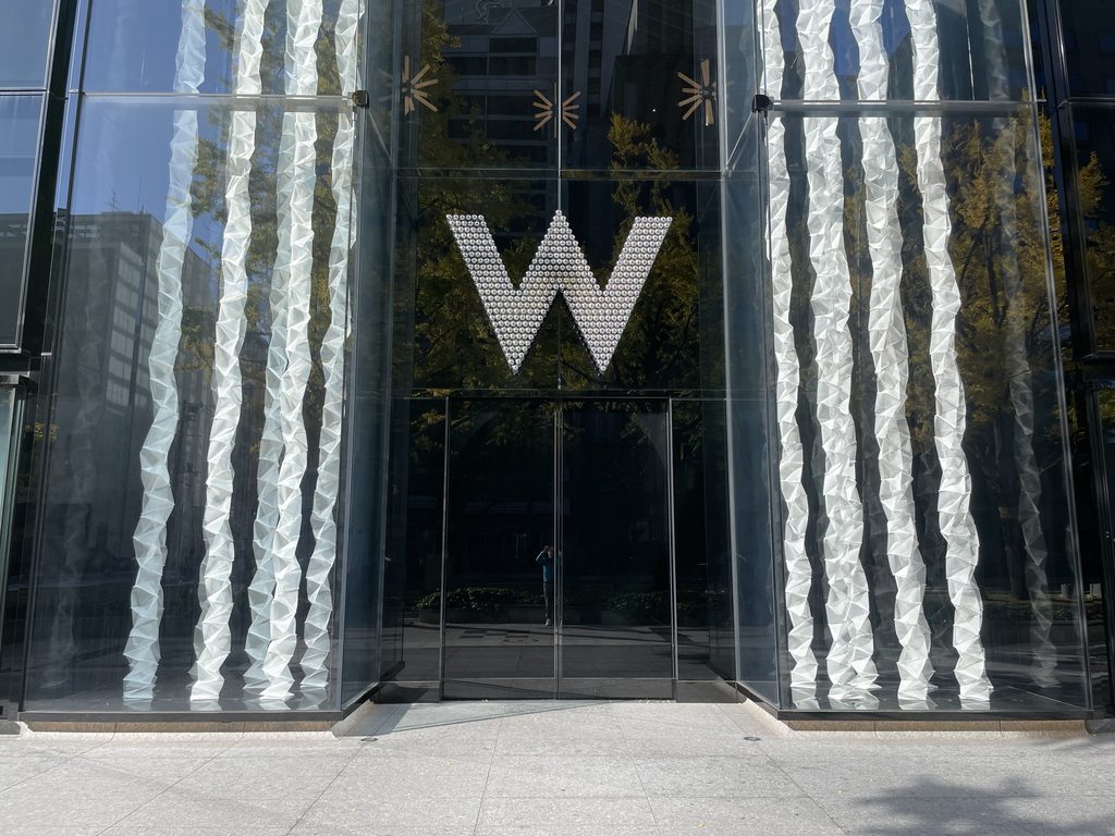
日建設計の作品情報によれば、正面入口には高さ約21mのフレームレスの門型ガラスボックスが設けられている。
ガラスを大きく使うことで、外壁の黒い量感とは異なる軽やかさが生まれている。高層部では壁面の連続が強調される一方、低層部では透明性と反射が建築の印象を左右している。
また、入口の装飾は外観全体のなかでは比較的限られた範囲に集中している。
この部分だけを見ると華やかなホテルの入口であるが、少し離れて建物全体を眺めると、黒い外壁との対比がより明確になる。
According to Nikken Sekkei’s project information, the main entrance incorporates a frameless, gate-shaped glass structure approximately 21 metres high.
This extensive use of glass creates a sense of transparency and lightness that contrasts with the solid appearance of the upper tower.
The two parts of the building therefore communicate with the city in different ways.
Above, the repeated dark surfaces emphasize the tower’s verticality. Below, reflections and transparency become the dominant architectural elements.
The decorative treatment is also concentrated around the entrance rather than distributed uniformly across the facade.
Viewed close up, the entrance has the theatrical quality expected of a luxury hotel. From farther away, it becomes part of a much more restrained architectural composition.
3. 街路と建築が重なる、御堂筋側の立面
Where the Building Meets the Streetscape
入口から少し距離を取ると、ガラス張りの低層部が御堂筋に沿って続いていることが分かる。
外壁のガラスには周辺のビルや街路樹が映り込み、建物の表面に大阪の街並みが重なっている。
この写真では、黒い外壁の垂直なライン、ガラスに映る街路樹、歩道の舗装が一つの画面に収まっている。
Moving away from the entrance, the continuous glazing along the lower floors becomes more apparent.
Reflections of neighboring buildings and roadside trees spread across the glass, changing according to the observer’s position.
In the photograph, the tower’s dark vertical lines, reflections in the glazing and the paved sidewalk are all visible within the same view.
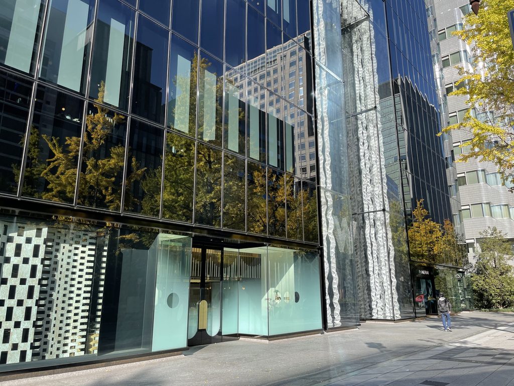
ここで興味深いのは、建物の外観が一つの素材だけで完結していないことである。
高層部では黒い外壁そのものが建築の輪郭をつくっている。しかし、低層部ではガラスに映る周囲の風景も、外観の印象を左右する要素となっている。
御堂筋は街路樹の並ぶ大阪の主要な通りであり、建物はその都市環境と切り離されて存在しているわけではない。
街路に面したガラスは、外部の景色を映し込みながら、ホテルの内部へと人を迎え入れる境界でもある。
建築を単独の造形物として見るだけでなく、歩道からの距離や街路樹との重なりを含めて眺めることで、W大阪の都市建築としての側面が見えてくる。
What makes this elevation interesting is that its appearance is not determined by a single material or surface.
The upper floors rely on the repetition of dark architectural elements to establish a clear silhouette.
At street level, however, the reflected surroundings become part of the visual composition.
Midosuji is one of Osaka’s principal urban avenues, distinguished in part by its broad sidewalks and rows of street trees.
W Osaka occupies this setting rather than standing apart from it. The glazed facade reflects the activity and physical character of the street, while also forming the threshold through which visitors enter the hotel.
Considering the building from the sidewalk therefore reveals a different aspect of its design.
It is not only a dark tower with a distinctive outline, but also a piece of urban architecture whose appearance changes in response to its immediate surroundings.
4. 白い曲面に包まれる、光のトンネル
A White Tunnel Filled with Oval Openings
黒い外壁とガラスの入口を通り抜けると、内部には外観とはまったく異なる空間が現れる。
その代表的な場所が、白い曲面に包まれたトンネル状の通路である。
壁から天井まで連続する曲面には、大小さまざまな楕円形の孔が密集している。
孔は規則正しい格子状ではなく、曲面に沿って少しずつ向きや大きさを変えながら配置されているように見える。
Passing beyond the dark facade and glass entrance, visitors encounter an interior environment that differs dramatically from the building’s exterior.
One of the most memorable spaces is a tunnel-like passage enclosed by continuous white curved surfaces.
Numerous oval-shaped openings of different sizes cover the walls and ceiling.
Rather than forming a rigid rectangular grid, the openings appear to change in orientation and scale as they follow the curvature of the passage.
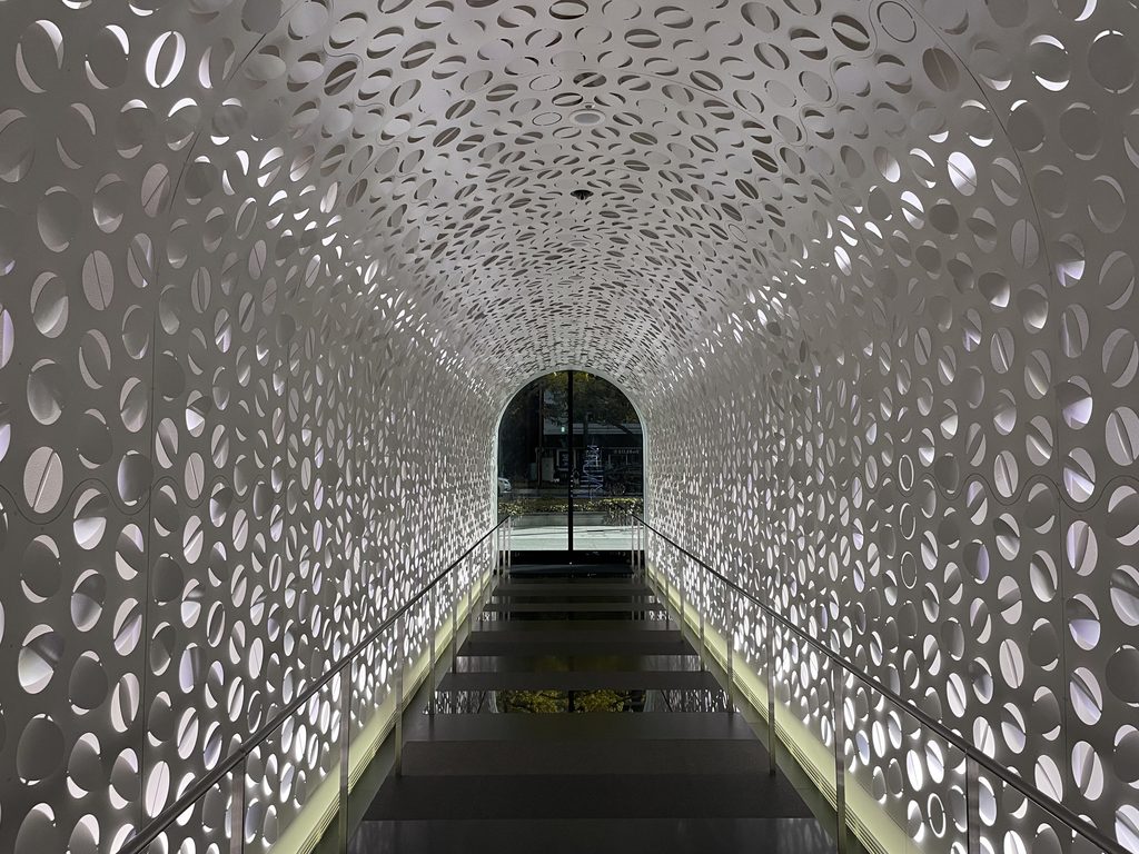
通路の中央には階段が設けられ、その両側には手すりが続いている。
階段を奥へ向かって見下ろすと、トンネルの曲面が遠近感を強調し、先にある開口へと視線を導いている。
白い壁面には照明の光が当たり、孔の内側に細かな陰影が生まれている。外観の直線的な構成とは対照的に、ここでは曲面と孔の反復が空間を特徴づけている。
A staircase runs through the centre of the passage, with handrails extending along either side.
Viewed along the stairs, the continuous curve of the tunnel emphasizes the depth of the space and directs attention towards the opening at its far end.
Light falls across the white surfaces, producing subtle shadows within the individual openings.
The resulting composition differs sharply from the dark, rectilinear geometry of the exterior.
Here, the architectural experience is defined by curved surfaces, repeated openings and the movement of light across them.
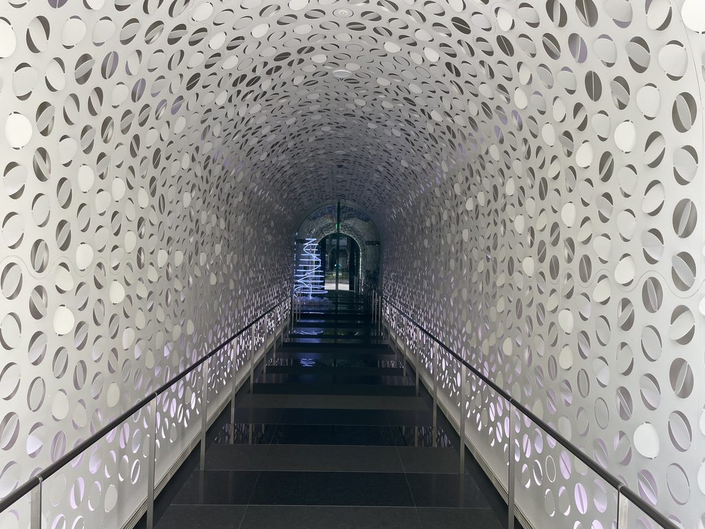
二つの写真を比較すると、同じトンネルでありながら、撮影位置によって見え方が異なることが分かる。
一方では通路の奥行きが強く感じられ、もう一方では壁面を覆う孔の密度や曲面の連続が目立つ。
このトンネルは、単に目的地へ移動するための通路というだけではなく、ホテルの内部へ入ったことを強く意識させる空間として機能しているように感じられる。
ただし、この内部意匠を安藤忠雄個人の設計として断定することはできない。W大阪のインテリアには別のデザインチームが参加しており、建築全体の監修と個々の内部空間のデザインは区別する必要がある。
Comparing the two photographs reveals how the same passage changes according to the viewpoint.
In one image, the depth of the tunnel and the direction of the staircase are particularly prominent.
In the other, the density of the openings and the continuity of the curved enclosure become more noticeable.
The passage appears to serve a purpose beyond simply connecting one area of the hotel to another. Its unusual geometry makes the transition into the interior a memorable spatial experience.
It is important, however, not to attribute this particular interior design directly to Ando without supporting documentation.
While Ando provided design supervision for W Osaka, the hotel’s interiors involved other designers. The overall architectural concept and the authorship of individual interior elements should therefore be considered separately.
5. 幾何学的な天井と、華やかなホテルの内部空間
Geometric Ceilings and an Extravagant Interior
トンネルとは異なる内部空間にも、W大阪らしい大胆な造形が見られる。
写真に写るエントランス付近の空間では、天井が複数の三角形や折れ面によって構成されている。
平らな天井を一枚設けるのではなく、面を折り重ねるような造形によって、空間の上部に複雑な陰影が生まれている。
Elsewhere inside W Osaka, the design becomes even more elaborate.
In the photographed interior space near the entrance, the ceiling is composed of numerous angular surfaces resembling folded planes.
Rather than forming a single horizontal surface, these intersecting shapes create a complex arrangement of light and shadow overhead.
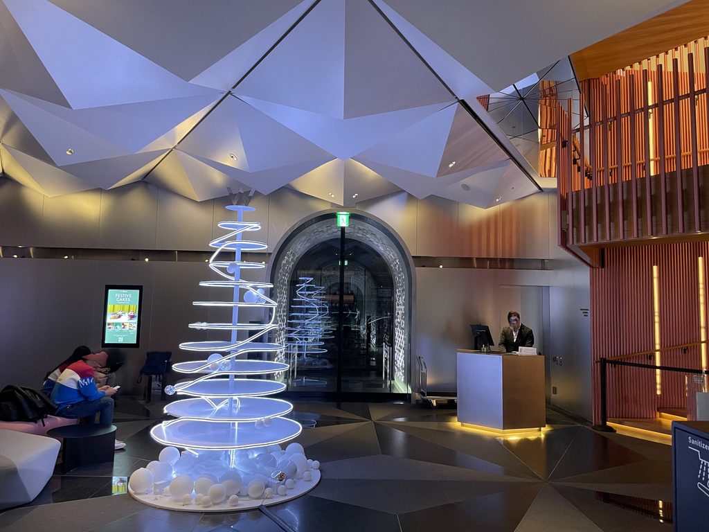
白い光が何層にも重なり、周囲の比較的暗い壁面や床との対比によって、その存在が際立っている。
また、奥にはアーチ状の開口が見え、右側には木質の縦格子を用いた部分がある。天井の鋭角的な形、オブジェの曲線、アーチ、縦格子と、異なる幾何学が一つの空間に組み合わされている。
素材や色彩の使い方も、外観とは大きく異なる。
外側では黒い壁面とガラスが中心であったのに対し、内部では白い光、木質の素材、金属的な反射、複雑な天井の造形が重なっている。
高級ホテルにふさわしい華やかさがあり、訪れる人に強い印象を与える空間である。
一方で、このような装飾的な構成は、安藤忠雄の代表的なコンクリート建築から受ける印象とは異なる。
もちろん、建築家の表現を特定の素材や形態だけで判断することはできない。しかし、W大阪では、建築の外側と内側で異なるデザインの考え方が用いられていることが、写真からも明瞭に読み取れる。
その違いを含めて体験することが、このホテル建築の特徴の一つといえる。
Below the ceiling stands a luminous spiral-like installation.
Its illuminated curves overlap in several layers, standing out against the darker surrounding surfaces.
An arched opening is visible farther inside, while vertical timber-like screens introduce another architectural rhythm to the space.
Angular ceiling planes, sweeping curves, arches and repeated vertical elements coexist within a single interior.
The materials and colors also differ significantly from those of the exterior.
Outside, black surfaces and glass establish the building’s character. Inside, illuminated white forms, warm-toned materials, reflective finishes and intricate geometric details create a far more elaborate atmosphere.
The result is a luxurious environment designed to make a strong impression on visitors.
At the same time, this decorative approach differs from the qualities commonly associated with Ando’s best-known concrete architecture.
Of course, an architect’s work cannot be defined by a single material or formal vocabulary.
Nevertheless, the distinction between the building’s restrained exterior and its expressive interior is particularly evident at W Osaka.
Experiencing that contrast is one of the most interesting aspects of visiting the hotel.
My Impression
御堂筋に建つW大阪は、以前から気になっていた建築の一つだった。
実際に訪れてみると、まず印象に残ったのは、やはり内部の豪華さである。
幾何学的な天井や光をまとったオブジェ、白い曲面に無数の孔が設けられたトンネルなど、どこを見ても凝ったデザインが施されている。
高級ホテルらしい華やかさがあり、空間そのものを楽しませようとする意図が感じられた。
ただ、正直なところ、安藤忠雄らしさを期待すると少々物足りなさもあった。
これまで見てきた安藤建築と比べると、コンクリートの質感や光と影の扱い、空間の緊張感といった、個人的に魅力を感じてきた要素が前面には出ていないように思えた。(これは致し方ないことだが)
もちろん、W大阪は安藤忠雄がすべてを設計した建物ではなく、建築設計やインテリアには別のデザイナーが参加している。そのことを考えれば、一般的な安藤建築とは異なる印象を受けるのも不思議ではない。
それでも、外観の黒い建物から、華やかな内部空間へと切り替わる体験は面白かった。
安藤忠雄の作品を訪ねるという目的で足を運んだが、結果として、建築家の個性とホテルブランドの世界観がどのように共存するのかを考える機会になった。
Visiting W Osaka, I was particularly struck by the luxurious interior.
The elaborate geometric ceiling, the illuminated sculptural installation and the white tunnel covered with countless oval openings all contributed to an atmosphere of extravagance.
It certainly felt like a high-end hotel, with considerable attention given to decorative details and the overall visual experience.
At the same time, I have to admit that I found myself missing some of the qualities I personally associate with Tadao Ando’s architecture.
Having visited many of his buildings over the years, I have come to appreciate the way concrete, natural light and shadow can create spaces with a distinctive sense of restraint and tension.
At W Osaka, those familiar qualities did not seem as prominent to me.
That does not necessarily make the building any less interesting. Ando was involved in design supervision, while other architects and designers were responsible for the building’s detailed architectural and interior design.
Still, as someone visiting with an interest in Ando’s work, I could not help feeling that his individual architectural character was somewhat less apparent here.
The transition from the dark exterior to the extravagant interior was certainly memorable.
Ultimately, the visit left me thinking about how an architect’s personal approach can coexist with the identity of an international luxury hotel brand.