【安藤忠雄建築】堺平成病院|縦のルーバーが包む、2019年の病院建築(SAKAI HEISEI HOSPITAL|A Hospital Wrapped in Vertical Louvers)
建築概要
Architecture Overview
- 名称:堺平成病院
- 外観デザイン/デザイン監修: 安藤忠雄
- 基本・実施設計: 日揮株式会社
- 所在地:大阪府堺市中区深井沢町
- 竣工:2019年
- 規模: 地上8階
- 用途:病院
- Name:Sakai Heisei Hospital
- Exterior Design / Design Supervision:Tadao Ando
- Basic and Detailed Design:JGC Corporation
- Architect:Tadao Ando
- Completed:2019
- Location:Fukaisawamachi, Naka-ku, Sakai, Osaka, Japan
- Floors:8 above ground
- Type:Hospital
堺平成病院は、堺温心会病院と浜寺中央病院の統合によって2019年に誕生した病院である。建物は2019年2月に竣工し、同年4月に開院した。
この建築で安藤忠雄が担当したのは病院全体の設計ではなく、外観デザインである。病院公式サイトは安藤忠雄に外観デザインを依頼したことを明記し、日揮側資料では安藤忠雄建築研究所を「デザイン監修」、日揮株式会社を「基本・実施設計」としている。
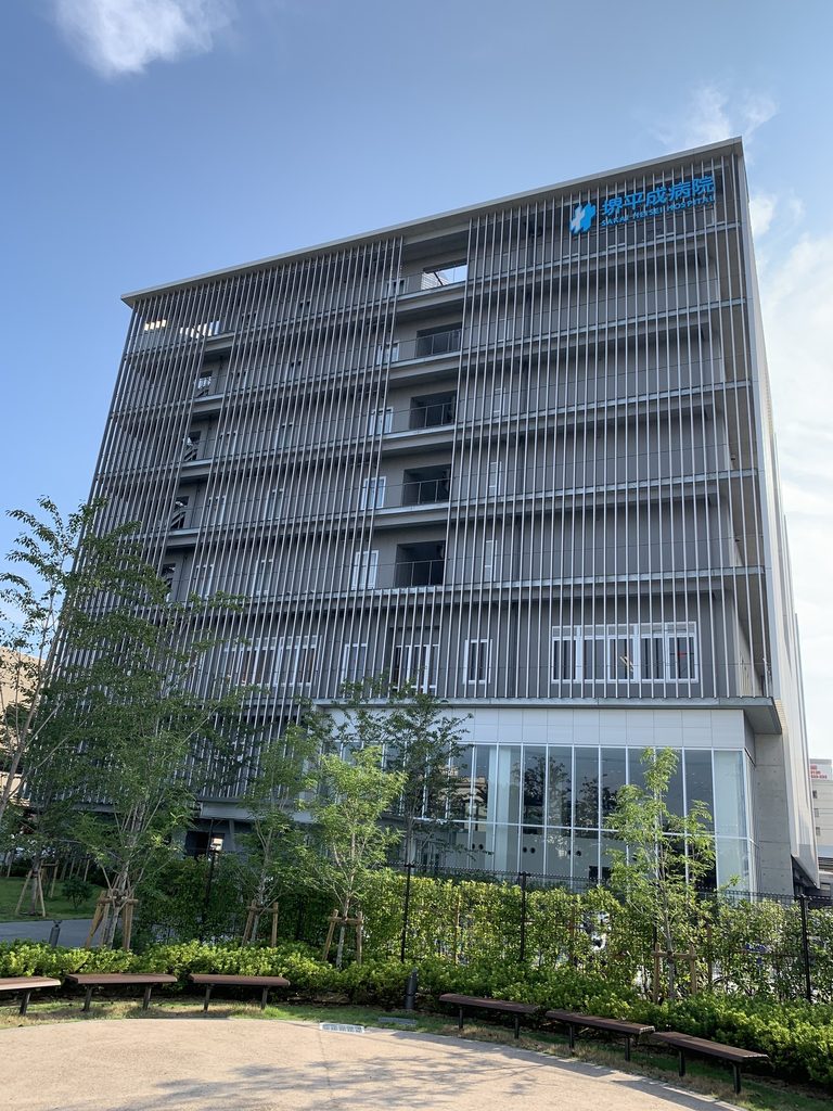
外観を特徴づけるのは、建物の周囲に繰り返し配置された細い縦ルーバーである。病院公式もこの外装ルーバーについて、見る角度や時間によって表情が変化するデザインとして説明している。2019年8月に撮影した写真からも、ルーバーの密度や重なりが見る位置によって大きく変化する様子を確認できる。
Sakai Heisei Hospital opened in April 2019 following the merger of Sakai Onshinkai Hospital and Hamadera Central Hospital. The building itself was completed in February of the same year.
Tadao Ando’s role in this project requires an important distinction. The hospital’s official website states that Ando was commissioned to design the exterior, while JGC documentation identifies Tadao Ando Architect & Associates as design supervisor and JGC Corporation as responsible for basic and detailed design.
The exterior is defined by slender vertical louvers extending across large portions of the elevations. Their visual density changes significantly according to viewing angle, giving the large hospital building a different appearance as one moves around it.
1. 建物を覆う細い縦線
Vertical Lines across the Building
道路から堺平成病院を見ると、最初に目に入るのは建物そのものの壁面よりも、その外側に並ぶ大量の縦ルーバーである。
From the street, the most immediate feature is the repeated field of vertical louvers.
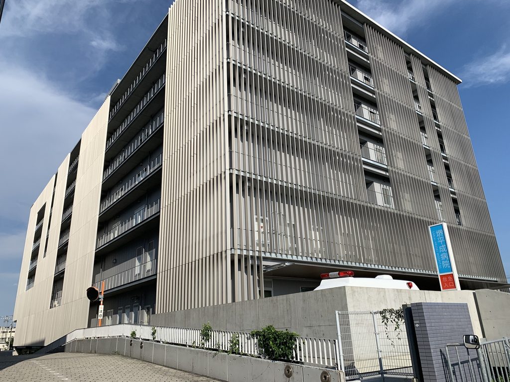
細い部材が各階をまたいで連続し、窓やバルコニー、壁面をその奥に見せている。一枚の外壁をそのまま見せるのではなく、建物の外周にもう一層の面を重ねたような構成である。
Windows, balconies and walls remain visible behind this outer layer rather than forming the primary surface of the elevation.
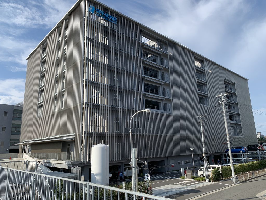
斜め方向から見るとルーバー同士の間隔が視覚的に狭まり、壁面のように見える。一方、正面に近づくにつれてその隙間が開き、背後の窓や外壁が現れる。
Seen obliquely, the louvers overlap visually and become almost wall-like. From a more frontal position, the gaps open and reveal the building behind them.
2. 角を回ると変わる密度
Changing Density at the Corners
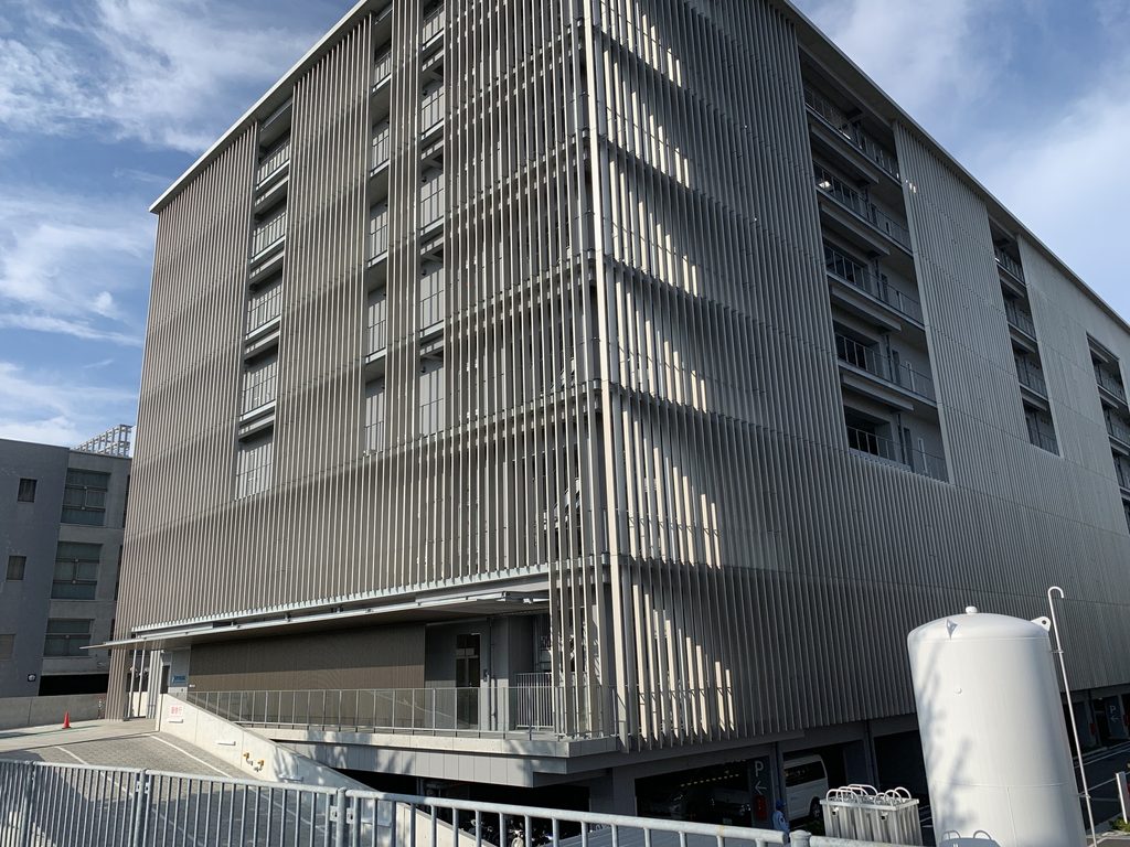
建物の角では、二つの立面に設けられたルーバーが重なって見える。正面から見たときの規則的な縦線が、角度を変えるだけで細かな格子のような密度へ変わる。
At the corners, louvers from two elevations overlap in view, increasing the apparent density of the façade.
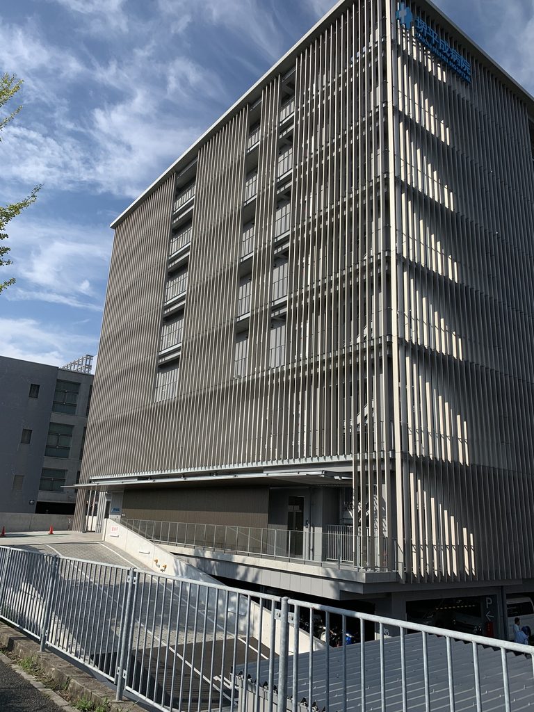
さらに位置を移すと、ルーバーの奥に病室の窓や各階の水平ラインが見えてくる。縦方向の部材が建物の高さを強調する一方、その背後では床や窓が水平に反復している。二つの方向性が重なることで、大きな病院の立面が一枚の平坦な面になることを避けている。
Behind the vertical elements, windows and floor lines establish a second, horizontal order. The interaction between these two directions breaks down the scale of the large hospital elevation.
3. ルーバーのない面との対比
Contrasting Elevations
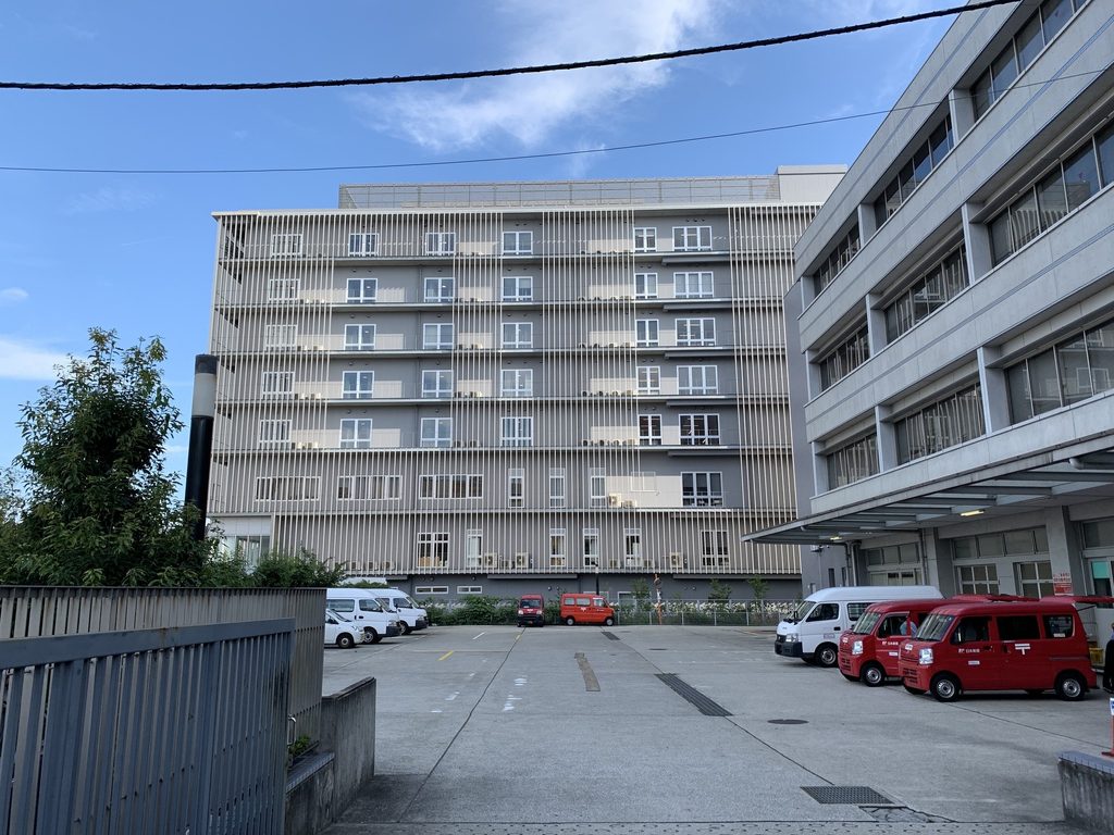
建物を回り込むと、ルーバーが全面を覆っていない場所も現れる。ここでは窓や設備、各階の水平線が直接見え、ルーバーに包まれた立面とはかなり印象が異なる。
Not every elevation is covered in the same way. In several areas the windows, equipment and horizontal floor lines remain more directly exposed.
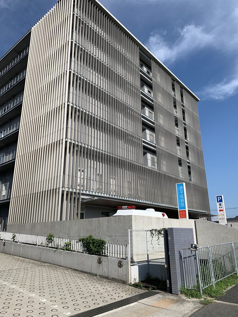
特に端部では、細いルーバーが並ぶ面と大きな壁面が接している。外装のすべてを同じ表現で統一するのではなく、ルーバーの密度と壁面の露出を場所によって切り替えていることが分かる。
At the ends of the building, dense screens of vertical louvers meet broader wall surfaces, producing a clear shift in appearance.
4. 地上階ではスケールが変わる
A Different Scale at Ground Level
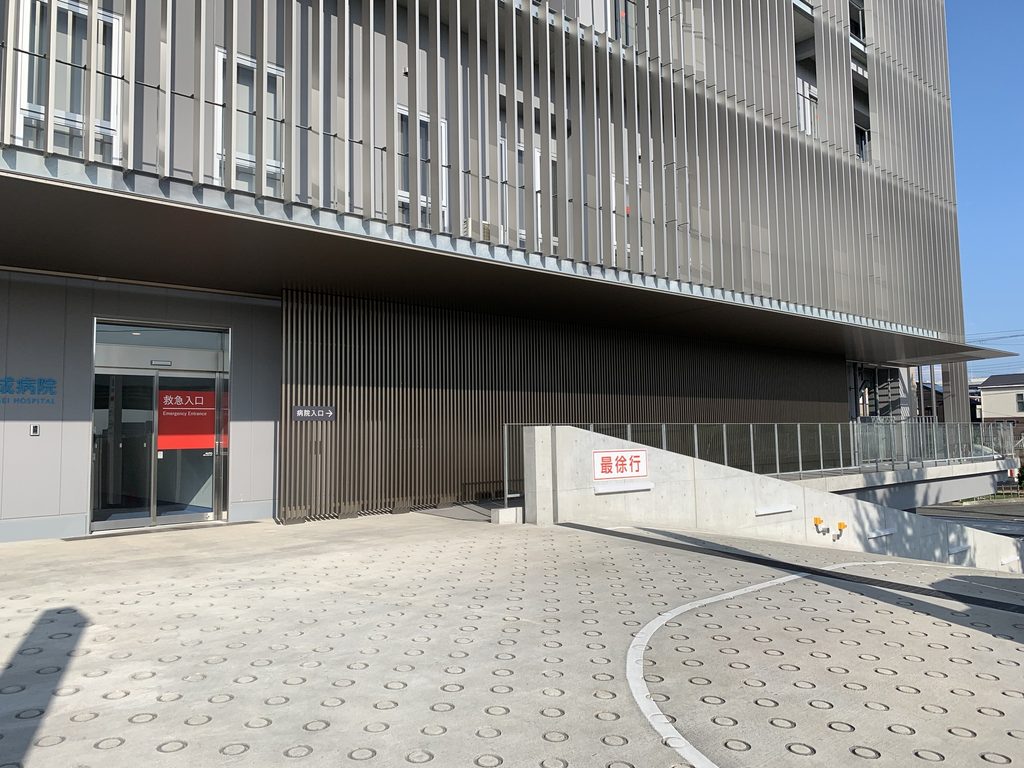
建物へ近づくと、上階を覆っていたルーバーが頭上まで降りてくる。遠景では建物全体を覆う細かな線として見えていた部材が、ここでは一本ずつ実体を持った外装部材として認識できる。
Closer to the building, the louvers are no longer perceived simply as lines across a façade. Their individual depth and spacing become apparent.
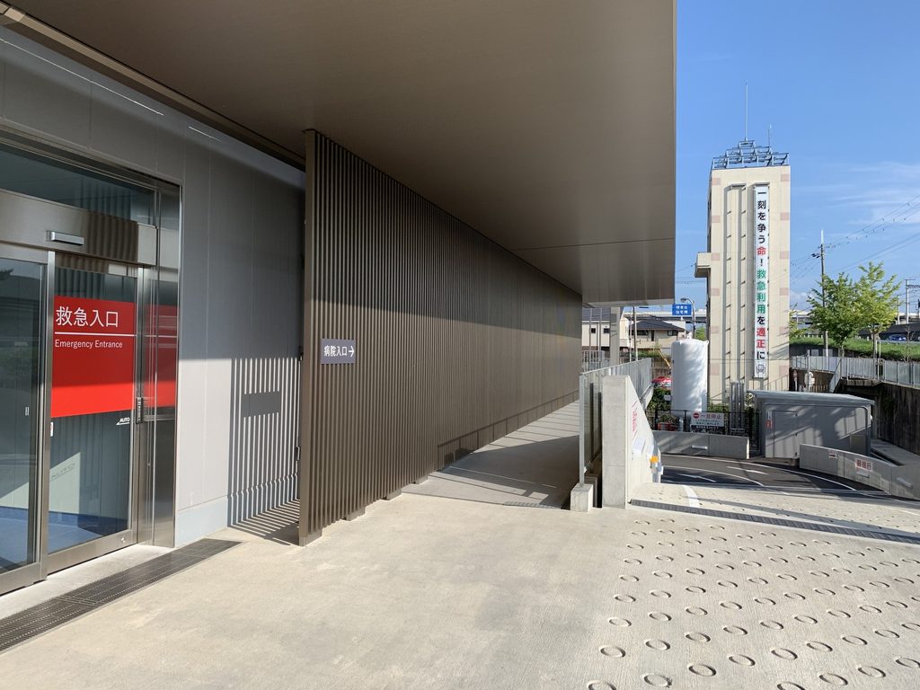
低層部には入口や通路が設けられ、上階とは異なるスケールで外壁が組み立てられている。大きな病院の外観をそのまま地面まで降ろすのではなく、人が歩く位置では庇や壁、開口によって細かく分節されている。
Entrances, openings, walls and canopies divide the lower level into smaller elements appropriate to the scale of pedestrians.
5. 庇の下を通る長い動線
A Long Route beneath the Canopy
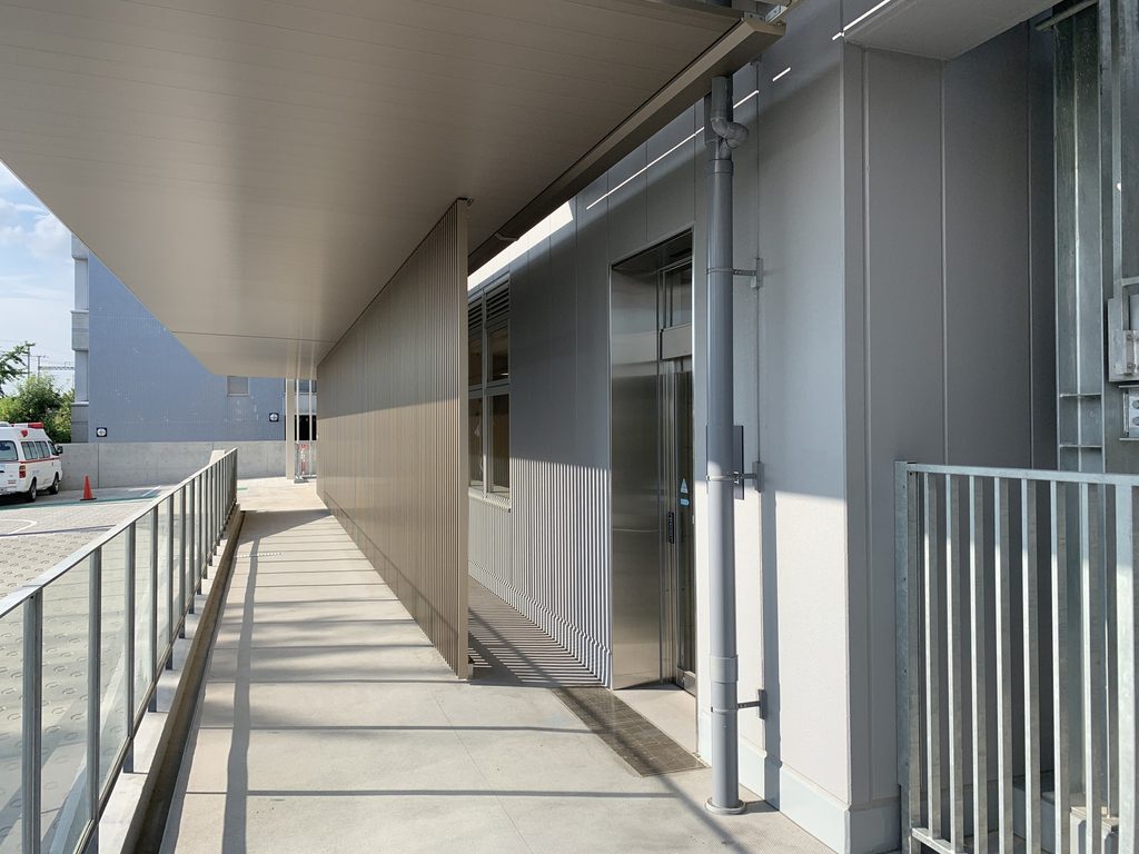
建物の脇には、長い庇に覆われた外部通路が続いている。頭上には水平な面が伸び、その片側には建物、反対側には手すりと外部空間が続く。高層部で強く見えていた縦線とは対照的に、この場所では庇と床がつくる長い水平線が前面に出ている。
Along one side of the hospital, an exterior passage extends beneath a long horizontal canopy. Here the dominant geometry changes from the vertical rhythm of the upper elevations to the long horizontal lines of roof and floor.
6. 正面側では植栽が建物との距離をつくる
Planting along the Approach
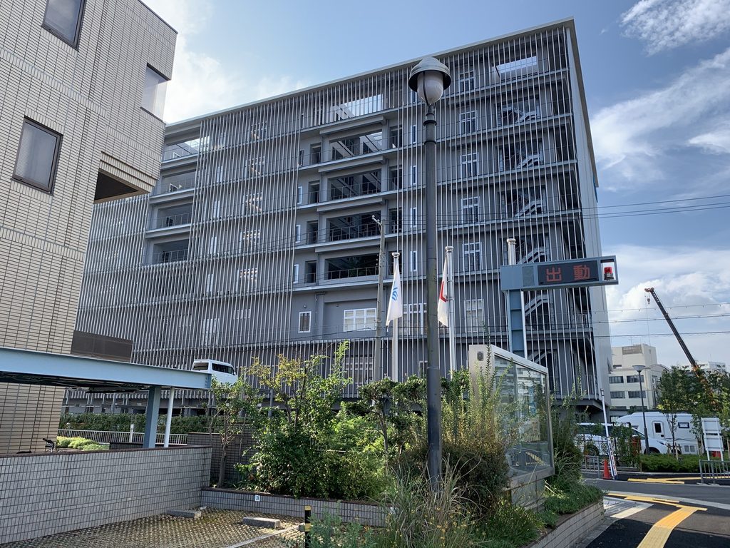
正面側へ回ると、建物の足元には樹木や植栽が配置されている。大きな病院棟が歩道際へ直接立ち上がるのではなく、緑地とアプローチを挟んで建物へ近づく構成になっている。
Trees and planting separate portions of the hospital from the surrounding streets and paths.
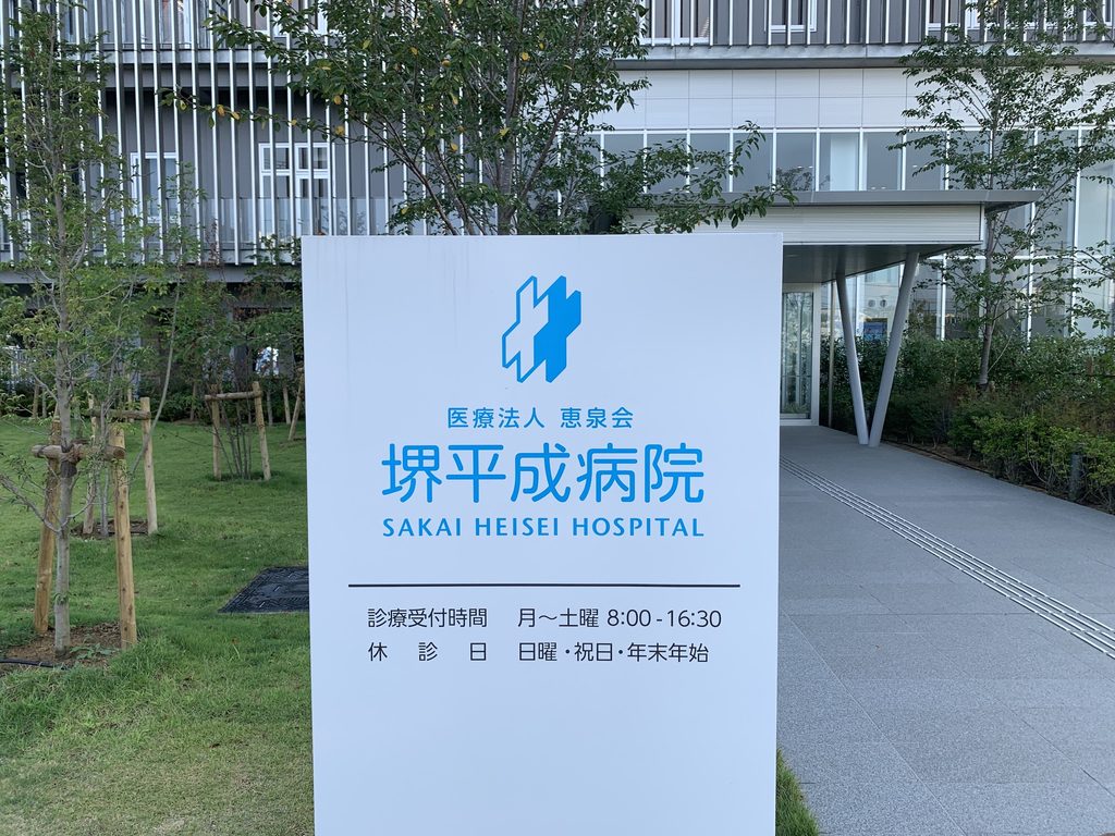
白い病院名のサインの背後には、縦ルーバーに覆われた建物が立ち上がる。ここでは「堺平成病院」という施設名と、その外観を特徴づける縦線を同時に見ることができる。
The hospital sign stands in front of the screened elevation, bringing the identity of the institution and the vertical exterior treatment into the same view.
7. 入口付近では外装の層が変化する
The Exterior Layer Opens near the Entrance
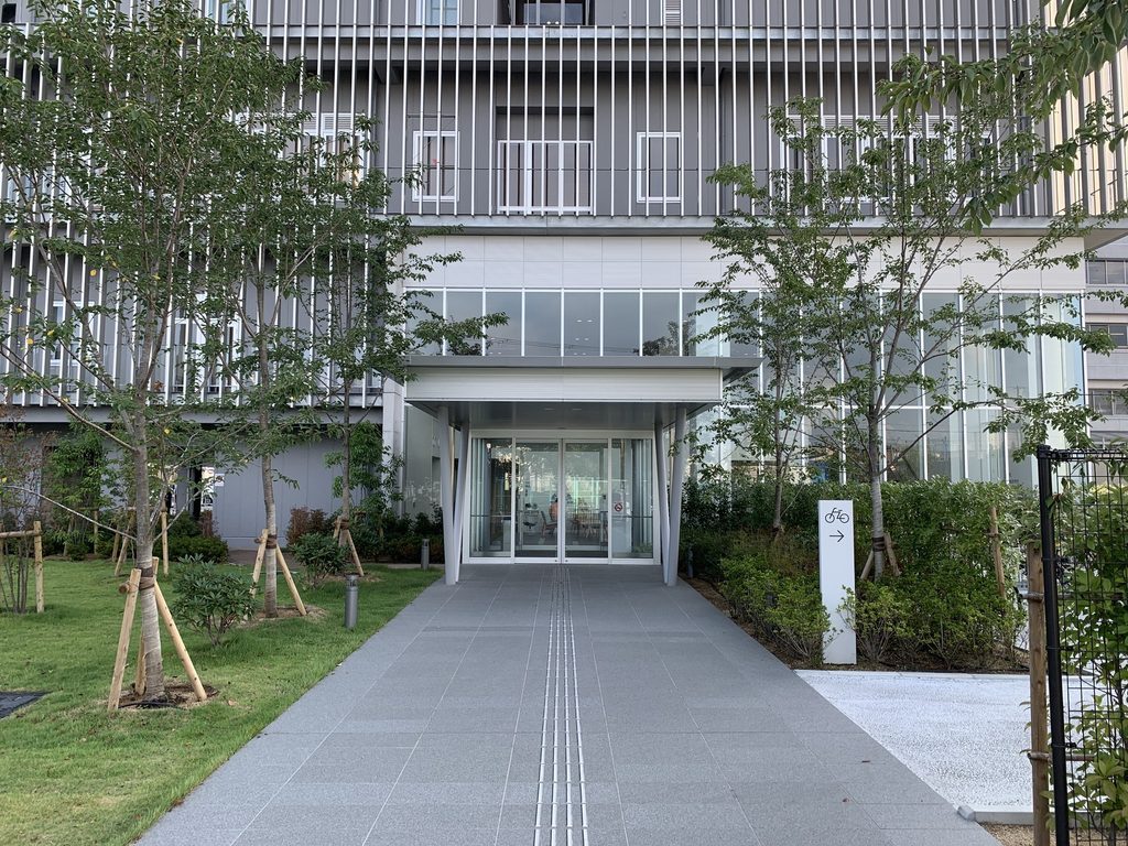
入口へ近づくにつれ、ガラス、庇、柱、植栽が重なり、遠くから見た規則的な立面とは異なる表情になる。外観全体を支配していたルーバーも、地上階では入口や開口に合わせて途切れる。
Closer to the entrance, glazing, canopies, columns and planting replace the more regular composition seen from a distance. The louvers that dominate the upper elevations are interrupted at ground level around entrances and openings.
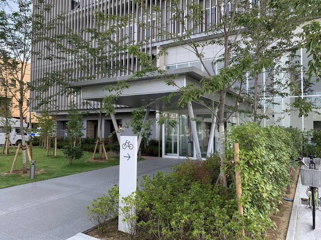
外から建物を一周すると、縦ルーバーは単なる装飾ではなく、距離と角度によって建物の見え方を変える外側の層として働いていることが分かる。
Walking around the hospital makes it clear that the louvers operate as an outer layer whose appearance changes continuously with distance and angle.
8. 「安藤忠雄設計」ではなく、外観デザインという仕事
Exterior Design Rather than Sole Authorship
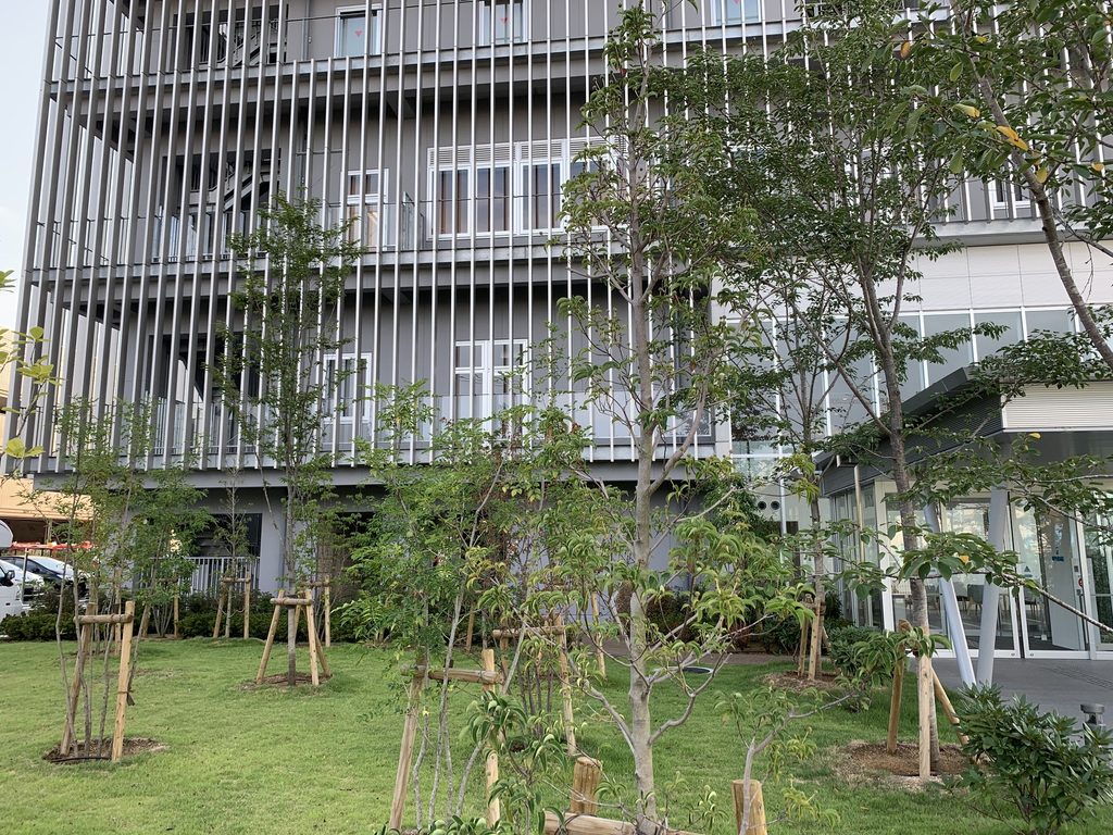
堺平成病院を見るうえで重要なのは、この建築を安藤忠雄による通常の単独設計作品と同じように扱わないことである。病院自身が明記している安藤の役割は外観デザインであり、日揮側資料では安藤忠雄建築研究所がデザイン監修、日揮株式会社が基本・実施設計を担当したとされている。
その前提で改めて外観を見ると、建物を覆う縦ルーバーこそが、この協働の中で安藤が関与した部分を読み取る重要な手掛かりになる。打放しコンクリートや幾何学的な壁だけが安藤忠雄の建築ではない。大規模な医療施設に対し、外装という限定された領域から建築の表情をつくる。堺平成病院は、安藤忠雄の仕事の広がりを見るうえでも興味深い一例である。
Sakai Heisei Hospital should not be described in the same way as a building designed entirely by Tadao Ando. The hospital itself identifies Ando’s contribution as exterior design, while JGC documentation credits Tadao Ando Architect & Associates with design supervision and JGC Corporation with basic and detailed design.
Seen in that context, the vertical louvers become particularly significant. They form the most distinctive element of the exterior and demonstrate another form of Ando’s architectural involvement: shaping the identity of a large medical facility through a specific layer of its design.
My Impression
堺平成病院を訪れたのは2019年8月。開院からまだ数か月しか経っていない時期で、外壁も植栽も新しい状態だった。
写真を見返してまず気づくのは、同じ建物をかなり多くの方向から撮っていることである。正面だけを見て終わるのではなく、角を曲がりながらルーバーの重なり方を追っている。実際、少し位置を変えるだけで外観の密度がかなり変わる建物だった。
一方で、初めて見たときに「いつもの安藤建築」とはかなり違う印象を受けたのも確かである。打放しコンクリートの大きな壁が前面に出るわけではなく、建物を特徴づけているのは細い金属製のルーバーである。
今回あらためて資料を調べ、その理由がよく分かった。安藤忠雄が建物全体を設計したのではなく、外観デザインを担当した建築だったのである。
そう考えて写真を見直すと、この建物の面白さも少し変わって見える。病院として必要な大きな建物の外側にもう一つの層を置き、見る方向によってその密度を変える。安藤忠雄の仕事を長く追っていると、こうした協働による建築に出会えることも、このArchiveを続ける面白さの一つだと思う。
I visited Sakai Heisei Hospital on August, 2019, only a few months after it had opened.
Looking back through the photographs, I notice how often I changed position around the building. Rather than photographing a single main façade, I kept following the louvers around the corners, where their density changed noticeably with each viewpoint.
The building also felt quite different from many other Ando works I had visited. Large exposed-concrete walls do not dominate the exterior. Instead, its identity comes primarily from the repeated vertical louvers.
Researching the project again for this archive clarified why. Ando was responsible for the exterior design rather than the complete architectural design.
That distinction makes the building more interesting to me now. It shows a different kind of architectural involvement: working within a large hospital project and giving its exterior a distinct identity through a carefully controlled outer layer.