【安藤忠雄建築】シマ・クリエイティブハウス|鋭角の敷地に立ち上がる、安藤忠雄の小さな都市建築(Sima Creative House | A Small Urban Work Shaped by a Sharp Tokyo Site)
建築概要
Architecture Overview
- 名称:シマ・クリエイティブハウス
- 設計:安藤忠雄
- 所在地:東京都港区南青山
- 竣工:2022年
- 用途:オフィス・本社
- Name:Sima Creative House
- Architect:Tadao Ando
- Completed:2022
- Location:Minami-Aoyama, Minato City, Tokyo, Japan
- Type:Office / company headquarters
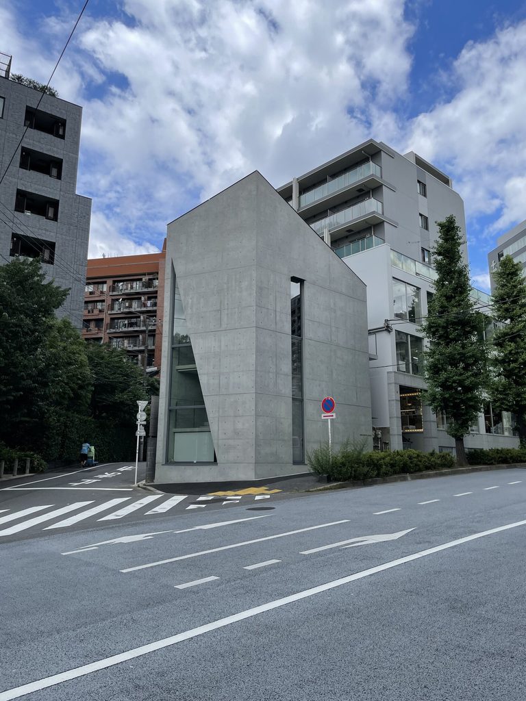
南青山の幹線道路から一本入った角地に、打放しコンクリートの建物が立っている。大きな文化施設でも、高級ブランドの店舗でもない。1964年創業の広告会社、シマ・クリエイティブハウスの本社である。同社は2022年5月9日からこの場所を本社としている。
周囲にはマンションやオフィスが密集し、道路は建物の手前で二方向に分かれる。敷地の輪郭そのものが、正面を一つに決めにくい形をしている。安藤忠雄はその条件を均すのではなく、建物の姿として表に出した。
Sima Creative House stands on a compact corner plot just off a major road in Minami-Aoyama. It is neither a cultural institution nor a flagship store, but the headquarters of an advertising company founded in 1964. According to the company’s official website, this address became its headquarters on May 9, 2022.
The surrounding neighborhood is dense with apartments and offices, and the road divides into two directions at the building’s narrow end. Rather than disguising this awkward geometry, Tadao Ando gives it architectural form.
1. 街路の分岐を受け止める輪郭
A Profile Drawn by Two Streets
交差点側から見ると、建物は一枚の高いコンクリート壁が立ち上がったように映る。だが、少し位置を変えるだけで印象は変わる。屋根の線は道路に沿って斜めに下がり、側面の壁は奥へ長く伸びていく。端部を薄く絞った輪郭が、二本の道の間へ差し込まれている。
Seen from the junction, the building first appears as a tall plane of exposed concrete. A small shift in viewpoint changes the reading. The roofline descends diagonally, while the side wall extends deeper into the block. The tapered end seems to have been inserted directly between the diverging streets.
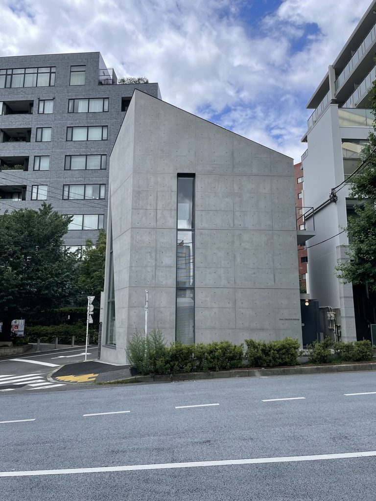
この建物には、一般的なオフィスビルのような均等な柱割りや、階ごとに反復する横長窓が正面に現れない。道路に向いた面の多くは壁であり、内部の活動をそのまま街へ並べる構成ではない。それでも閉ざされた箱には見えない。鋭角側に設けられた大きなガラス面が、壁の量感を切り分けているからである。
The street elevations do not follow the familiar office-building pattern of repetitive horizontal windows. Much of the exterior remains solid, keeping the activity inside from being displayed evenly across the façade. Yet the building does not become a sealed concrete box. A large triangular field of glass cuts through the mass at its sharpest edge.
2. 三角形の開口が示す内部の高さ
A Window That Reveals Vertical Movement
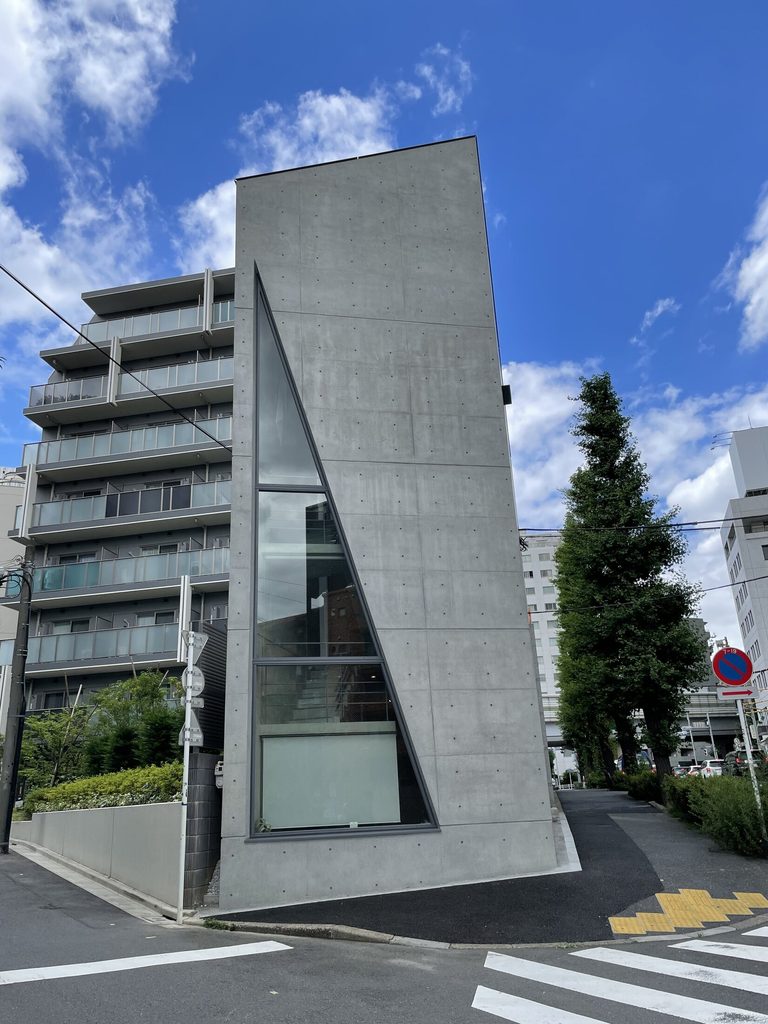
もっとも目を引くのは、地面近くから上方へ伸びる三角形のガラス面である。斜辺が建物の輪郭と呼応し、細くなる先端が視線を空へ導く。窓は単に採光のための穴として収まらず、コンクリートの壁を二つの面へ分ける切れ目として働いている。
The triangular window rises from near ground level and narrows toward the sky. Its sloping edge follows the geometry of the building, turning the opening into more than a source of daylight. It reads as a cut that separates two concrete planes.
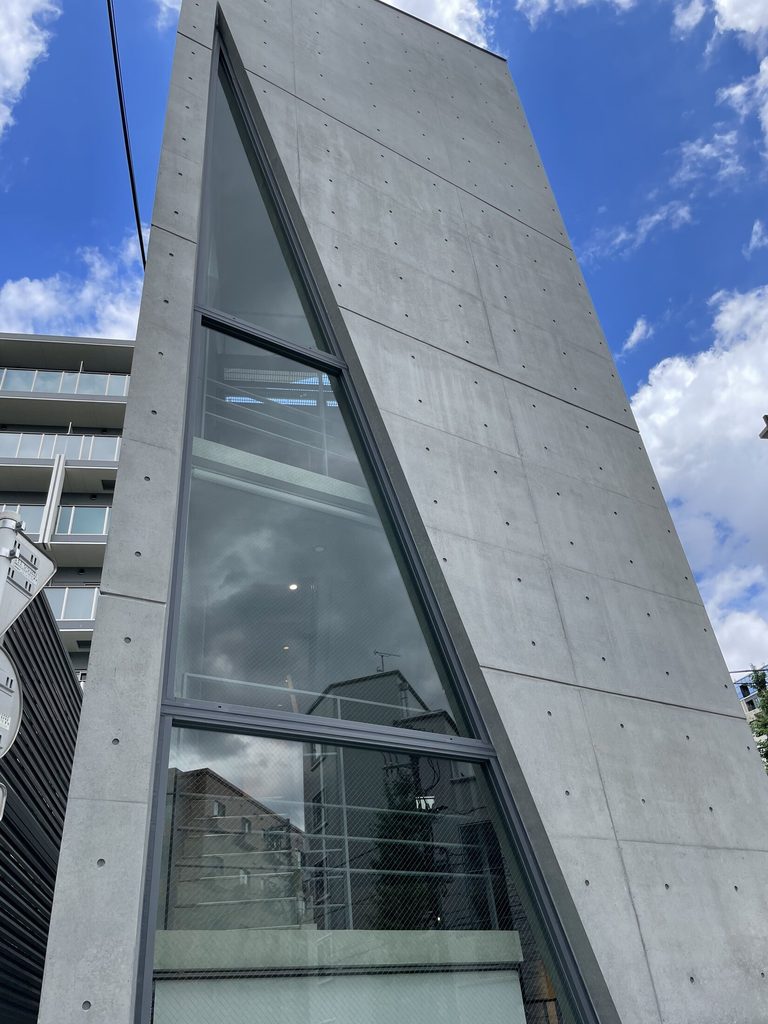
ガラス越しには、階段や床の縁が断片的に見える。外から内部の全体像を読み取ることはできないが、複数の高さが連続していることは伝わってくる。壁の外側にいながら、建物の中を上下する動きを想像できる。この見せ方が、小さな建物に垂直方向の奥行きを与えている。
Through the glass, fragments of stairs and floor edges are visible. The exterior does not disclose the complete organization of the office, but it does reveal that several levels are connected behind the wall. Even from the street, the eye can trace an imagined movement upward. This partial view gives a compact building a greater sense of vertical depth.
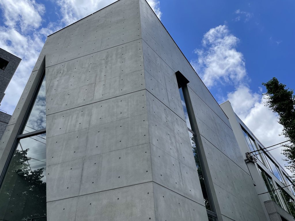
反対側の立面では、コンクリート壁の中央に細長い開口が通されている。通りに面した側では大きな開口が視線を引きつける一方、建物を回り込むと、壁面に切り込まれた細長い開口が現れる。同じコンクリートの外壁でありながら、見る方向によって建物の表情は大きく変わる。全面をガラスで覆うのではなく、必要な場所だけを切り取る安藤建築の窓の扱いが、ここでも明快に現れている。
On another elevation, a narrow vertical slit replaces the broad triangular opening.On the street-facing side, a large opening immediately draws the eye. As you move around the building, however, narrow vertical openings cut into the concrete walls begin to appear. Although the exterior is formed from the same exposed concrete throughout, the character of the building changes markedly depending on where it is viewed from. By varying the shape and extent of glazing from one face to the next, Ando gives each approach a distinct character without abandoning the building’s material consistency.
3. 小さな社屋に与えられた存在感
A Modest Headquarters with a Clear Identity
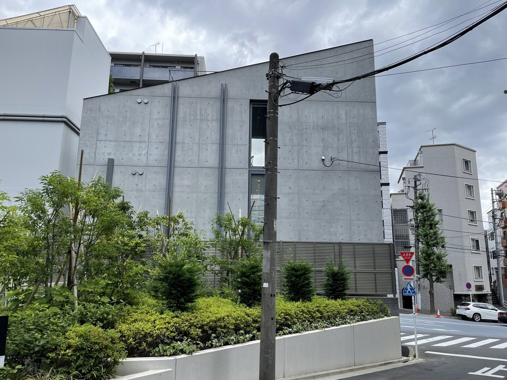
背面側へ回ると、設備や配管を伴う実用的な面が現れる。正面側の鋭い輪郭とは違い、こちらはコンクリートの壁面が建物の奥行きを率直に示している。植栽、電柱、電線、隣接建物が近接する状況も隠されていない。建築単体の完全な造形というより、都市の限られた隙間にどう立つかを考えた建物であることが分かる。
The rear elevation is more practical, accommodating visible services and equipment. Here the concrete wall describes the depth of the building more directly. Planting, utility poles, overhead wires, and neighboring structures remain part of the view. The architecture is not presented as an isolated object; it is a response to a restricted piece of the city.
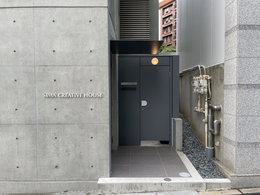
入口は大通り側で強く主張せず、隣の建物との間に引き込まれている。コンクリート壁に掲げられた社名、濃いグレーの扉、小さな円形照明、深い庇。限られた幅の中に要素を収め、通りの開放感から一転して、人の身体に近いスケールへ切り替えている。
The entrance is tucked into the narrow space beside the neighboring building. The company name is fixed directly to the concrete, accompanied by dark gray doors, a small circular light, and a deep metal canopy. Within a very limited frontage, the scale shifts from the open street to the dimensions of a person approaching the door.
広告会社の本社としては、看板や色彩による派手な演出はない。代わりに、敷地の鋭角、壁の高さ、窓の切り方によって建物そのものが記憶に残る。決して大きな建物ではない。それでも駒沢通りを歩いていると、周囲の建物とは明らかに異なるコンクリートの輪郭が目に入る。近づいて角を曲がると、それまで見えていなかった壁や開口が現れ、正面だけでは建物全体を捉えきれないことが分かる。こうした都市の街路に対する建ち方を考えると、1987年竣工の旧JUN本社も興味深い。規模や形態は異なるが、街路に対してコンクリートの輪郭をどのように現すかという点では、時代を隔てた二つの作品を比較して見ることができる。シマ・クリエイティブハウスは、都市の制約を避けるのではなく、それを建築の輪郭へと置き換えた、安藤忠雄の近年の作品である。
For the headquarters of an advertising company, the building uses remarkably little signage or color. It is by no means a large building. Yet while walking along Komazawa-dori, its concrete silhouette stands apart from the buildings around it. As you approach and turn the corner, walls and openings that were previously hidden come into view, making it clear that the building cannot be fully understood from the front alone. The outline is grasped in a moment, yet each turn around the exterior reveals a different arrangement. Another interesting example of Ando’s corporate architecture in Tokyo is the former JUN Headquarters, completed in 1987. Although different in scale and form, the two buildings offer an intriguing comparison across decades in the way exposed concrete establishes a distinct architectural presence within the city. SIMA CREATIVE HOUSE is a recent work by Tadao Ando that does not resist the constraints of its urban site, but transforms them into the very form and identity of the architecture.
My Impression
私が訪れたのは、同社が新社屋へ移転して間もない2022年7月である。写真で切り取ると大きな壁がまず目に入るが、現地では建物の小ささと、その輪郭の強さが同時に感じられた。南青山の密集した街並みの中で、コンクリートの壁だけが周囲から切り離されて見えるわけではない。隣のマンションや電線まで含めて、東京の街角にきちんと収まっていた。
印象に残ったのは、正面を一枚撮れば終わる建築ではなかったことである。交差点側の鋭い立面、三角形の窓、細長いスリット、控えめな入口と、数歩動くたびに注目する場所が変わる。内部には入れなかったが、ガラス越しに階段の一部が見えたことで、外観だけでも空間のつながりを少し想像できた。大作とは異なる距離感で、安藤建築の輪郭と光の扱いを確かめられる建物であった。
I visited in July 2022, shortly after the company moved into its new headquarters. In photographs, the concrete wall can make the building appear larger than it is. On site, its compact scale and strong profile were present at the same time. The building did not feel detached from Minami-Aoyama; the neighboring apartments, street trees, and overhead wires remained part of the experience.
What stayed with me was how difficult it was to understand the building from a single viewpoint. The pointed elevation, triangular glazing, narrow slit window, and recessed entrance came into focus one after another as I walked around it. I could not enter, but the partial view of the stair through the glass offered a glimpse of how the interior might connect vertically. Even from outside, it was possible to follow Ando’s handling of outline, concrete, and light at an unusually intimate scale.